Float
(Floaters:
12 )
Description:
built environment collective
Status:
Work in progress
Viewed:
2939
Share:



Lets Discuss
great concept ... why this black shadow attached to the letter E ...
ReplyThanks bernd :o) Update
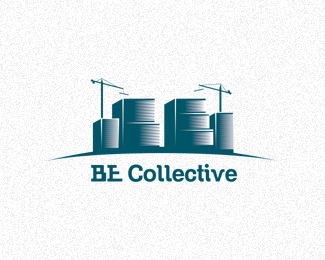
ReplyI LOVE this concept, and the illustration is killer. But that type is a detriment to the design. First, the outline typeface just doesn't really work, and as Bernd mentioned, that weird shading behind the Es is puzzling. Secondly, it's not necessary to style the %22BE%22 in the same way as you have it in your illustration. Doing so makes the %22BE%22 in the illustration less special, and it also detracts from the sense of accomplishment one gets from discovering that the forms in the illustration are, in fact, a B and an E. And lastly, the type really should be centered beneath the illustration. It's weirdly off-center now, and I can't seem to find a good reason why.**I'd say that you're about 85%25 away from a really killer mark, if you can just find a way of working out a good type solution.
ReplyOh wow. Just as I typed out that response, I see that you've fixed everything I thought was wrong with the type. Great job! I might enlarge the type just a bit so that the left edge of the B aligns with the left edge of the leftmost building, and the right end of the bowl of the E aligns with the right edge of the rightmost building. Otherwise, I think this is looking really good now!
Replyagree ... no more words ... %3BD
ReplyThanks guys :o)
ReplyCool work! You might enlarge some of the small details of the cranes and such. In the thumbnail I thought it was microphones over a drum set made from barrels!
ReplyThanks :o)
ReplyUpdate Type :o)
Replyi Like it !!
ReplyThanks Bernd :o)
ReplyThanks all for Support :o)
Replythanks femili :o)
ReplyPlease login/signup to make a comment, registration is easy