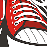
i only worry about what it looks like when small. There are many small things with strokes around them, which would make things hard to read. I think this works great for a sign or illustration, and i really love some of the details, especially how the ribbons become hands. I think for a logo version, though, it must be greatly simplified.
gotcha. it works great in all of those scenarios. Congrats on the gallery. **However, and not to bring up a sour subject or anything, I just wonder about the qualifications of gallery entry, as this, to me, is an illustration. **I realize that this is the criteria:**%22Colin and I add logos to the gallery, based on a few factors:*1. quality - does the logo looked polished/professional*2. does the content of any imagery pertain to the text*3. how do the shapes and textwork with each other to form a whole*4. kerning - not exact kerning but enough that it feels time was paid in looking for that*5. uniqueness - does this logo while fitting its brandstand out from others like it*6. color - do the colors used work for the composition*7. creativity - use of negative space, linking of letters, line form, texture, ect.*8. persoanl taste - last on the list and last in the decision making process.%22**but i think that another one should be added in there and that is functionality as a logo....as this is a logo site. If something doesn't work when it's tiny, then it's not a logo. I'm all for having more complex versions of a logo that can be used when it is large, but it should be a runoff from an original, simpler logo. Sure, seeing illustration on here is great, and I don't have a problem with it, the only beef I have is when I see it in the gallery representing a logo site. Not trying to be a grumpy old man, here, just a thought that was crossing my mind.**And I'm sorry 13mu, that I'm posting this on your image, because I really do love all of your work, I hope you know that. I've had this thought in my mind for a while about logos vs. illustration. It just happened to be here that I'm letting it all out.


Lets Discuss
Ear must jut out, Deniska)
ReplyI hope last, Excuse for quantity) %3B)
ReplyYes, LadyGrey %3B) This is pleasant to me more
ReplyDeniska, and you carry a tie-butterfly?
ReplyYes, happens, after all I not all time do logos%0D*http://www.gazeta.spb.ru/f/sport/laureus_putin.JPG %3B)
ReplyI LOVE what you did with the banners! very clever layout.
Replycontrast on the reds and browns should be improved though IMO.
Replythere you go. has some real character. fun.
ReplyThanks guys, I appreciate your comments
ReplyUPD last %3B)
Replysmall UPD%0D*removed some inaccuracies and holes, absolutely last :)
ReplyWow Denis! As Logomotive said, it's really clever layout :)
Replyi only worry about what it looks like when small. There are many small things with strokes around them, which would make things hard to read. I think this works great for a sign or illustration, and i really love some of the details, especially how the ribbons become hands. I think for a logo version, though, it must be greatly simplified.
ReplyMegakruto!
ReplyNice one!
Replyfor this http://www.ljplus.ru/img4/1/3/13mu/HMall.jpeg
Reply%5E superb
ReplyWhat a sexy poster!
Replygotcha. it works great in all of those scenarios. Congrats on the gallery. **However, and not to bring up a sour subject or anything, I just wonder about the qualifications of gallery entry, as this, to me, is an illustration. **I realize that this is the criteria:**%22Colin and I add logos to the gallery, based on a few factors:*1. quality - does the logo looked polished/professional*2. does the content of any imagery pertain to the text*3. how do the shapes and textwork with each other to form a whole*4. kerning - not exact kerning but enough that it feels time was paid in looking for that*5. uniqueness - does this logo while fitting its brandstand out from others like it*6. color - do the colors used work for the composition*7. creativity - use of negative space, linking of letters, line form, texture, ect.*8. persoanl taste - last on the list and last in the decision making process.%22**but i think that another one should be added in there and that is functionality as a logo....as this is a logo site. If something doesn't work when it's tiny, then it's not a logo. I'm all for having more complex versions of a logo that can be used when it is large, but it should be a runoff from an original, simpler logo. Sure, seeing illustration on here is great, and I don't have a problem with it, the only beef I have is when I see it in the gallery representing a logo site. Not trying to be a grumpy old man, here, just a thought that was crossing my mind.**And I'm sorry 13mu, that I'm posting this on your image, because I really do love all of your work, I hope you know that. I've had this thought in my mind for a while about logos vs. illustration. It just happened to be here that I'm letting it all out.
ReplyHoroshaya marka!
Replybrilliant work!
ReplyI have always loved the banner hands. Such a wonderful realiation!
ReplyThanks guys!%3B)
ReplyCongrats on the featured showcase. Good work!
ReplyThanks Jeffrey
ReplyI love the entire showcase! Your style is very unique. It really sets your stuff apart from the basic logos out there. Awesome job!
Replyklassnyi zaiasa!:)))
ReplyNice crest,it's too bad the small type has to be so squished.
Replyit's realy...
Reply...fine tuned :)
Reply%3B) !!
ReplyThis is absolutely amazing!
ReplyCute! I love it!
ReplyThanks guys!!!%3B)
ReplyIt is magnificent!)
Replyreally good , i just feel the left hand is a bit off
ReplyThanks, Thanks, Thanks )
Replyawesome
ReplyGreat work pal!
Replyreally fine piece of work. love the colours too
ReplyReally great
ReplyThanks guys!%3B))
ReplyThis is fantastic! Love the illustration!
Replyamazing!
ReplyThat\'s Woooow good :)
ReplyPlease login/signup to make a comment, registration is easy