Helmethimb
by 13mu • Uploaded: Apr. 09 '11 - Gallerized: Apr. '11

Float
(Floaters:
76 )
Description:
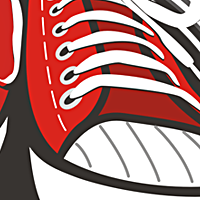
Knight's workshop, manufacture of knightly armor.
Status:
Nothing set
Viewed:
9566
Share:

Lets Discuss
Very nice! I only don't like the clash of %22helmet%22 and %22thimb%22.
Reply@matto - visor :)
ReplyOoh, I've just noticed that it is one word. Missed some space between %22helmet%22 and %22thimb%22 before :) Good job!
ReplyUPD%0D*Thanks Matto )
ReplyGood armor, Deniska!
ReplyReally nice armor! Knights feel!!
ReplyGreetings to your majesty Den the Great!
ReplyOh, thank you all guys.%0D*Nikita, felt myself in warcraft %3D))
Replylooking good, but the perspective of the dots at the top is bugging me. is it just me?
Replyit does not matter, because the upper surface of the working and can be curved. I saw it, but thank you, Andreiu, for your comment %3D)
ReplyGreat work!
ReplyOne more work in gallery )
Replyawesome !
ReplySUPER!
ReplyThanks ()-)
Replynice piece. like it. good detail.
Replyi like the style but the dots havent got the right perspective, also some other tweaks but i do like it
Replybrilliantly clever and executed
ReplyReal nice work here, sir.
ReplyThanks ()-) Sean, guys. I appreciate your opinions and comments.
ReplyReally cool idea. I can see what some are saying about dots. I like how your created the Mesh Armor background.
ReplyUPD dots
ReplyThanks Mike,UtterCreative %3D)
Replynow it's perfect!
ReplyGood upd!
ReplyWow great improvement with the updated dots! Great work!
ReplyThanks fellas
ReplyLove the look of this!
Replynice update with the dots noticed the white line above the text is little thin compared to the rest of them still like it though
ReplyYes,.. Nice update!
ReplyThanks guys for your comments %3B) , updatings looks better
Replyvery nice :)
ReplyWOW, I'm blown away by this. Really stellar work!
Replywow ... wow ... wow ... !!!
Replywow...fabulous talent....WOWeee!!!!!!
ReplyThanks!%0D*
ReplyPlease login/signup to make a comment, registration is easy