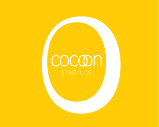
cocoon graphics 2
by 0morphine0 • Uploaded: Apr. 23 '09

Float
(Floaters:
1 )
Description:
A flat version of my logo for my graphic design business. I would love your feedback please!
Status:
Nothing set
Viewed:
1993
Share:

Lets Discuss
i dunno why but it reminds me of chiquita bananas :P the 'graphics' is very hard to read.
ReplyThe surrounding circle seems nice and gives the reel of embracing the text inside like a cocoon. The background color seems peaceful and it's warm like a cocoon would feel. The main problem i can detect is only the size of the word %22graphics%22 it's really difficult to read... You could try it a bit bolder or change the caps to make it easier to read even if some loose some typo shapes the legebility is more important.*I would say (that's only my personal taste speaking) it would be better to enchance the overall aspect a little bit more. If you are representing something related to graphics you should present some in the logo, maybe more colorsm maybe some shades or subtile fx... *keep up the good work!
ReplyPlease login/signup to make a comment, registration is easy