soundspectre
by !mude • Uploaded: Sep. 24 '09 - Gallerized: Sep. '09

Float
(Floaters:
69 )
Description:
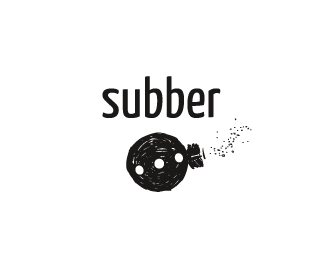
wip - logodesign for a online music review blog/site. Any feedback will be appreciated - thanks.
Status:
Client work
Viewed:
12527
Share:


Lets Discuss
The record is subtle and it works great. Here's something to consider or utterly ignore: Since the record spins clockwise, the icon should be a mirror opposite of itself. Currently the movement is counter-clockwise.**Love the colors and the type works well.
Replyyeah i think that's a good point...for cds as well (i think). Nice looking logo. I dig it.
ReplyThanks for the feedback guys - and I see your point. However I will loose the two S's if I mirror the mark - not sure if that's a good trade off.
ReplyAhh! I didn't read that before. Fantastic piece!
ReplyThanks again chirp - appreciate the feedback.
ReplyLike this a lot!
ReplyDidn't see the S's in the first place, but it's a great mark.. dunno if u should mirror it.
Replyvery good stuff, regards
Replyhighly lovable.
ReplyThanks all - appreciated.
ReplyThanks derek
ReplyVery nice. What's the name of the font used in this?
ReplyThanks keymak3r - it's Gotham
ReplyUploaded new version with final colors chosen by client.
ReplyJust caught this over on LOGOFI %3E Hot stuff man! :)
ReplyThx guys, appreciate it.
Replybeauty!
ReplyThanks dude.
ReplyPlease login/signup to make a comment, registration is easy