Advantage Racquet Tech V2
by zmcfarlen • Uploaded: Nov. 07 '07

Float
(Floaters:
0 )
Description:
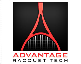
Here is another pass at a logo for a tennis racquet technician, specializing in racquet restringing. See version one at http://logopond.com/gallery/detail/19184 Trying to simplify the mark some, but has it gotten too flat? I welcome your suggestions. Thanks!
Status:
Nothing set
Viewed:
1176
Share:
Lets Discuss
They type is nice, but just showing a racquet standing alone is a little boring. Why don't you use the center part of the racquet (the space between the grip and the head) as one of your %22A's%22 in %22ADVANTAGE%22?
ReplyYou don't know that unless you try. There might be a way to make it work. It's at least worth taking a look at. If it doesn't work then it's only 5 minutes of your time wasted. If it does work then you have a more dynamic logo. Isn't that what being a %22creative%22 is all about clashmore?
ReplyI actually tried integrating the racquet as the first %22A%22 in this version, and didn't come up with a solution that worked for me. But it may be worth giving another shot. Any specific ideas on different ways to treat the racquet? As you can see in V1, I cropped it to focus on the %22A%22 form but got feedback that it looked too much like the Eiffel tower. Is the racquet strong enough to stand on it's own without the wordmark? On decals, for example?
Replyat first glance, it looked like a rope to me :)
ReplyPlease login/signup to make a comment, registration is easy