Sierakowice
by riocreativo • Uploaded: Mar. 27 '17 - Gallerized: Mar. '17


Float
(Floaters:
9 )
Description:
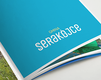
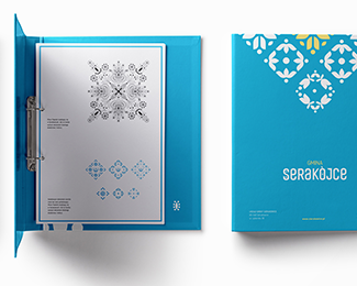
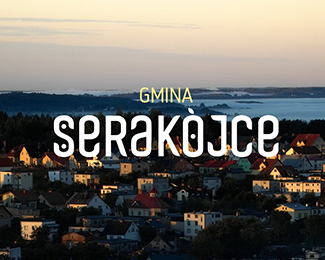
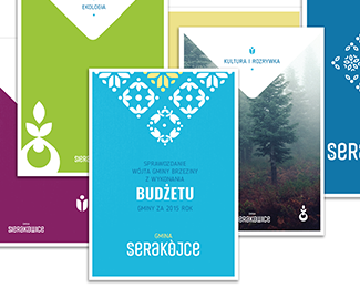
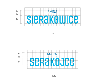
Sierakowice is a commune situated in the north of Poland. Although it is small, it is very aware of its assets and opportunities that stem from them. One of the ideas for utilising its potential and making communication coherent was branding. The conception is based on characteristic Kashubian patterns, which is a direct reference to the first school of embroidery, the history and tradition of Sierakowice.
https://goo.gl/9djJ0R
As seen on:
https://www.behance.net/gallery/49836483/Sierakowice
Status:
Client work
Viewed:
2073
Tags:
•
branding
•
pattern
•
Serakojce
Share:


Lets Discuss
I think the logo might be a little bit misunderstood for a standard receiver without the insight in the philosophy, but the patterns and overall execution is outstanding. I love it! :)
ReplyPlease login/signup to make a comment, registration is easy