Domin Bakery
by riocreativo • Uploaded: Jan. 26 '17 - Gallerized: Mar. '17


Float
(Floaters:
10 )
Description:
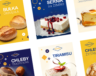
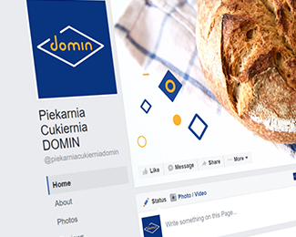
Domin is one of the biggest bakeries in the Pomeranian region in Poland.
The brand is deeply rooted in clients' awareness. However, rebranding proved to be necessary.
Although the logo has so far been well-recognised, it was overloaded due to its old-fashioned, multicolor 3D form.
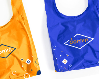
The decision to change packaging designs was an opportunity to work on branding in a wider context as well.
In order to take advantage of the brand's recognizability, we couldn't steer too far away from its previous visual form.
In our new design we decided to use similar colors and composition but simplify the sign itself. In addition, we created other visual identity elements, such as the patterns on packaging or company vehicles.
Meanwhile, take a look at the first results of our rebranding work (in progress). > https://goo.gl/whiESb
Status:
Client work
Viewed:
2622
Tags:
•
branding
•
rebranding
•
bread
Share:


Lets Discuss
Please login/signup to make a comment, registration is easy