Hiletswork
by melvynpau • Uploaded: Nov. 13 '18 - Gallerized: Nov. '18

Float
(Floaters:
10 )
Description:
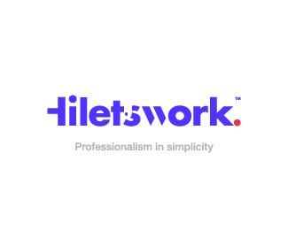
Logo design for my own creative agency.
Status:
Client work
Viewed:
4350
Tags:
Logo design
•
Minimalism
•
Minimalist
•
Modernism
Share:


Lets Discuss
i think you should leave the H fully formed, the quote mark and the font are expressive enough
Reply@GLC @GLC Thank you, I really appreciate your kind suggestion. You know, as this is for my own agency, it's been hard to decide the correct one. I left the "H" like so cos of this
Replyhttps://logopond.com/melvynpau/showcase/detail/288123
How do you think it looks just the H and the W?
that works because you are not trying to read it, it works as a free standing mark, even though its letters. this is trying to be read and the H makes it difficult.
ReplySuch as really nice post. I have really impressed. Thanx for sharing this post. If you do not have an office installed on your computer, see the instructions below to access the application and for the office, setup goes https://godonnybrook.com/microsoft-office-setup/
ReplySuch as really nice post. I have really impressed. Thanx for sharing this post. If you do not have an office installed on your computer, see the instructions below to access the application and for the office, setup goes https://godonnybrook.com/microsoft-office-setup/.
ReplyYeah, you should leave the full H. When I first read it, I thought that H was a t.
ReplyHello, I enjoy your concept on this project and the simplicity you were going for. I checked the link you provided to the "HW" and I think the letter H should be left fully to avoid your audience guessing or misinterpretation. Your choice of typeface says it all. I am a fresh graduate of G Design, and I heard that we should be careful how we tweak the beginning letter in a logotype as that is the entering point. Overall, I like the name and the "TM" execution.
ReplyPlease login/signup to make a comment, registration is easy