Love Piano
by jeropp • Uploaded: Dec. 20 '09
Description:
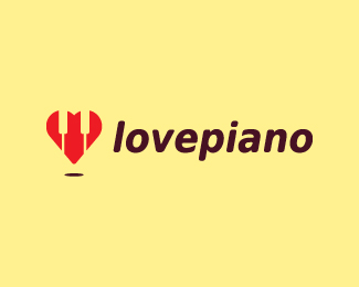
Attractive logo for a music business, blog, forum, radio show, general website etc...
The idea for this came from my love for the piano/keyboard - my main hobby :-)
Status:
Nothing set
Viewed:
4254
Share:




Lets Discuss
I like the idea but i think it not very obvious right now. Maybe you can try to tilt the heart in such a way the there's a horizontal line on top where you can place the negative spaces.
ReplyThis isn't working at all. In fact, a much better execution of the concept is here:*http://logopond.com/gallery/detail/85366
Reply@fogra: Anyway I can improve this?
Reply@fogra: i see what u mean by the other concept but i was looking for a more subtle approach
Reply@fogra: any way i can improve this?
Reply@fogra: any way i can improve this? i see what u mean by the other concept but i was looking for a more subtle approach
ReplyMaybe you could indicate the lid of a grand piano tilted or open to represent the heart. I would personally only use red and black colours also.
ReplyPlease login/signup to make a comment, registration is easy