2 Boys in a Bed on a Cold Winter's Night
by JeffFisherLogoMotives • Uploaded: Jan. 08 '07 - Gallerized: Mar. '08
Description:
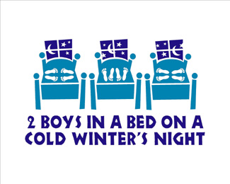
This logo for a play is one nearly 100 I have designed for one theatre company over the last 16 years. The logo appears in the books New Logo &
Trademark Design (Japan), The New Big Book of Logos, and Logo & Trademark Collection (Japan)
As seen on:
bLog-oMotives
Status:
Client work
Viewed:
26085
Share:

Lets Discuss
nice. it's very eye-catching.
ReplyWAW! WAW! I like the title. I like the style. I like the idea! It makes me smile )))
ReplyJeff, a very bold logo indeed. The title and logo both direct towards sex between two adolescent males (indicated by the 3 'stages' of the foot positions in the beds: foreplay, intercourse, and then sleep, bodies turned away from each other). Did your client want it to convey underage gay sex? it's sure to get some riled up in the general populous, but then plays often tackle controversial issues.
Replyonesummer - I appreciate your concern about the title of this play. However, in the play the term %22boys%22 does not refer to the under-aged, but is used as a generic term by gay men referring to other gay men. A description of the play reads: 'Set in New York circa 1987, this self-described erotic stage show is about men looking for some sort of warmth in the midst of the AIDS epidemic.' Still, you are right about a couple things - the play, and my logo, set out to be controversial and to get the general populous 'riled up.' The client is an avant garde theatre company that likes to push the limits with its productions.**The design made a great graphic for a T-shirt - which I wore quote often. Once, without even realizing it, I wore the shirt to the grocery store. A women came up to me and said %22What a great T-shirt design.%22 It was kind of fun watching the expression on her face change as she realized the sexual nature of the design - and quickly walked away.
ReplyOh my gosh - this is a logo critique and showcase site... why is this even being discussed?**Jeff - why are there 6 boys in this graphic? and 3 beds? The title reads %222 Boys in a Bed...%22 but the graphic shows 6 boys in 3 beds.
ReplyI say it's a time-lapse, since the moon is in a different position each time...so it's the the same bed shown during three stages of the night.
Reply@Jeff, thanks for adding the description of the play. I figured it was about pushing some limits.Good story about the lady in the grocery store, too. Made me laugh. Anyway, great logo%3B I totally got the time-lapse and every other clever depiction in the design. You have such a gifted talent to convey so much in such a simplistic way.
ReplyIf this logo is to promote the gay theme, shouldn't the feet in the middle be reversed?**Not to be over critical, but if you are going to make a logo that may even be considered a bit controversial, the feet are positioned to show the missionary position, a position to be used by a man and a woman, and would not work for 2 men.
Replyjbrom03 said: %22If this logo is to promote the gay theme, shouldn't the feet in the middle be reversed?**Not to be over critical, but if you are going to make a logo that may even be considered a bit controversial, the feet are positioned to show the missionary position, a position to be used by a man and a woman, and would not work for 2 men.%22**LOL. You would be surprised what two men can do in bed - funny, just about as much as a man and a woman (and men can have sex in a missionary position if you want to get %22technical%22). I don't believe I ever discussed what sex act was being performed by the two men in the graphic. Perhaps it's just frottage, or just kissing - or maybe this is just all too much information.... :o)
ReplyJeff:**I have never seen a logo successfully depict a story, I never thought to do it, mush less even thought it could be done well. I find this very inspirational. It started a great conversation as well, which I found hilarious, especially the comment from %22jbrom03%22, wow he must be a very detail oriented person to pick that out.**Great job! I look forward to seeing your next logo.
ReplyI might be totally off right now, many months later, but I just discovered this logo... It is so eye catching, when I first saw it, I didn't think to much about it, but I can't get it off my mind now :P*I actually thought the first bed was flirting, the other one was being in a relationship and the third one was %22we've been together for too long%22... Cool to read what the other wrote and thought, when I thought of something completely different!
ReplyFunny...maybe a coincidence. I just came across this same logo a few weeks back in the New Big Book of Logos and I wasn't really overly impressed with the style or the nature of the subject. Strange thing was that it did stick in my head. Having been a successful identity designer as well as a theatrical poster designer, it does what it is supposed to do-be memorable. Whether the subject is touchy, as a designer, you must find the best way to portray a subject. It does just that.**I would defend it but might have explored other ways to represent the theme. Just my thought here, maybe it really shouldn't have been titled as it is. A show about personal choice with the word %22boys%22 in the title should have been reconsidered. Just a design thought, I think it would stand well with out showing the scene in multiple stages throughout the night. It does get a bit confusing...really doesn't need the three beds. As an art director, I would have opted for just one. Graphic design is meant to clearly clean up what art messes up.**When I first saw the graphic, I too was a tad bit confused like some of you. I thought it was a room full of kids. Keep it simple...we have to remember as designers, we sit and stair at a design for so long that we become %22brainwashed%22 after a while. Sometimes our vision gets clouded and we believe that average folks out there will get it right away. The general public is not as savy on what a designer might see as the perfect graphic. I think it's the world designers are surrounded by. And if some designers didn't get it, the odds are it first confused then humored.
ReplyIts ashame some people do not get this logo. I have the feeling of it being very under-rated.**It does exactly what it should of, concerning controversy. It also tells a story and gets people talking.**Not a lot of people can do that.
Replyi hadn't seen this before, and i have to agree that it's a great logo!*i really like the time-lapse foreplay%3Esex%3Esleep or flirting%3Erelationship%3Eball'n'chain narrative. it really has a lot of character and embodies what the play's about--kudos, man!
ReplyI just now saw this logo on another site and it made me smile and do that %22ohhh, how clever!%22 thing. I should have known it was a Jeff Fisher! Once again, Jeff gets me to smile and doesn't even know it.
ReplyHave to agree with comments re 3 beds and 6 feet, but nice and fun graphic anyways!
ReplyNice work Jeff ... It is designed so nicely that for a moment you dont even realize if there're any sexual contents in there.
ReplyPlease login/signup to make a comment, registration is easy