A Rubber's Ducky
by JeffFisherLogoMotives • Uploaded: Jan. 06 '07 - Gallerized: Jan. '08
Description:
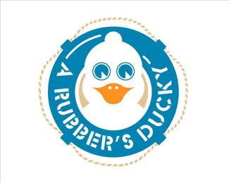
The duck's head being the shape of a condom with a reservoir-tip was a subtle "life preserver" message in this safe sex image. The logo appears in the books New Logo &
Trademark Design (Japan), The New Big Book of Logos, LogoLounge - Volume 1, New Logo & Trademark Collection (Japan), and Logos from North to South America (Spain)
As seen on:
Jeff Fisher LogoMotives
Status:
Just for fun
Viewed:
8681
Share:

Lets Discuss
very cute.. i like it.. :)
ReplySo creative!.
ReplyYeah buddy!!! I love it! It's the one!
ReplyI wonder if in a single color the beak area would not look like a mouth with the nostrils being two front teeth. I find there is too much going on in this in general and there appears to be no clear direction as to what execution you wanted to use. It reminds me greatly of what students create after their first hour with illustrator. Sorry to say but not on par with the rest of your work.
ReplyOnce again love it Jeff.
ReplyThere are art deco like curves, round corners and square corners, geometric eyes, no attention to maintaning object distances, wavy rope and about 6 or 7 heterogeneous stroke weights all together.
ReplyIn reference to the comments about the beak, I agree to an extent. Nostrils are typical illustrated black%3B since here they're white, at a casual glance (without looking at the typo) it can look like a kinda 'michelan baby' with an open mouth showing newly formed teeth.**But, I know it's a duck, because it says it's a duck...just like I know my lawn gnome is Frank Zappa :)
ReplyI can't help but that Sesame street song Rubber Ducky your the one, you make bathtime lot's of fun LOL!!, hey Jeff I have to admit that's pretty clever.
ReplyYou know what I mean Jeff? that song Ernie sings. ha ha!
Replyre: dache's rant.*it sounds like you have something to prove dache. jeff on the other hand has nothing to prove. %3B)
ReplyI also feel there's too much going on in this. I think it's largely due to the stencil font, which greatly increases the amount of separate shapes that occur in this logo. That, mixed with all of the other negative space details, makes it hard to read and quite busy, in my opinion.
Reply@ ryantoyota : The stencil font is very reminiscent of a pier. I think it works perfectly. Just my two cents. %3B-)**I don't think there's too much going on. The shapes are quite simplified to begin with.
ReplyI understand the reasoning for using the stencil font, but with the size of it compared to the lifesaver, the curve of the font, and all of the other negative spaced elements, I find it quite hard to read.
ReplyAs you said, perhaps it's just a personal preference, but I feel a logo needs to communicate an idea as quickly as possible, and when a logo begins to have so much going on that it slows the communication process, I feel it's too busy. Note that it doesn't necessarily have to communicate literally what it's for, but just quickly communicate an idea, feeling or brand.**Another way to judge it would be how easy it would be to reproduce it from memory after seeing it only a few times. In other words, how memorable is it? I know I could easily re-draw Apple's logo or Nike's logo after only a few glances, but this one I don't think I'd be able to remember.
Replyryantoyota said: %22Another way to judge it would be how easy it would be to reproduce it from memory after seeing it only a few times. In other words, how memorable is it? I know I could easily re-draw Apple's logo or Nike's logo after only a few glances, but this one I don't think I'd be able to remember.%22**Huh? How memorable a logo is has nothing to do with the ability of someone to redraw it - something most people in the general public wouldn't be able to do anyway. The memorability of a logo has much more to do with the mental impression, or association, an average person has of the company/product when seeing the image that represents the entity. **The odd thing about so many online critique situations is almost a perception that designers are (or should be) designing logos for other designers, when that is not the case. Designers create logos for a specific client/product and their target audience - and much of the success and memorability of a logo is based on attaining the desired results as an identity for the client as part of a larger marketing, advertising, public relations and branding campaign%3B not necessarily as a stand-alone element.**Interesting postings here. Thanks for all your comments.
Reply%22The odd thing about so many online critique situations is almost a perception that designers are (or should be) designing logos for other designers, when that is not the case.%22**I think Jeff hit the nail square on the head there...**We can praise or condemn each others work till the cows come home, but at the end of day it's immaterial, what matters is what the client thinks about the work %26 if the work serves its purpose as much as it possibly can.
ReplyThat's true, which is why it's annoying when designers post logos without explaining what they're for. It's impossible to determine if a logo is successful without knowing it's intended purpose. There's a bit of information about what this one's for, but no information as to its intended audience, so I just gave my opinion, which is that it's a busy logo. If it's for a condom company, I don't think it would work as well as if it was for say, a school education program, in which case it wouldn't be too busy, but I would think it would appeal more to primary students than teenagers. If that's the intended audience, great!*
ReplyOh, and about my memorability comment. What I was trying to get at was if a logo can be easily picked up subconsciously. More about brand familiarity and awareness than about memorability I suppose, which is really important for product branding. For instance, with the Apple or Nike logos, they're simple enough that when someone sees them on a product, they will subconsciously associate it with the millions of other times they've seen it in their peripheral vision and feel more comfortable with that brand because it feels familiar. That doesn't work as well with a busy logo, because it's too complex for someone to pick up subconsciously.
ReplyI don't know that I agree with you Ryan, specifically about the Apple and Nike Logos, they work because we have seen them millions of times before and the fact that they are simplistic forms I think has little to do with how successful they are as logos (that is: touchpoints for a brand) - I think this has been said before but in those cases the logos are successful because they are the logos of successful brands. Not the other way around.**I wonder how well the Nike tick would rank on logopond if we had never seen it before...
ReplyI've wondered that before as well. How well would the Apple logo rate if we'd never seen it before? I could see comments like %22it doesn't look like it has anything to do with computers to me%22 or %22I think you're presenting the brand name too literally.%22**I still think the concept of a simple logo holds true though. Obviously it's harder list examples of up-and-coming companies that use simplistic logos, because either they're still only being picked up by my subconscious, or they're not large enough that everyone would know about them yet. I do know, however, that in the supermarket for instance, the brands I feel most confident with (that I don't have prior experience with) are the ones with the more simple and unique logos. Is that because I've recognized the logo more in my subconscious, or is it simply because I'm a graphic designer and I tend to prefer things with better design?
ReplyLMAO I think this is a great design, superb stuff!!
ReplyPlease login/signup to make a comment, registration is easy