decipher
by Fogra • Uploaded: Apr. 18 '08 - Gallerized: Apr. '08

Description:
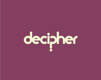
Concept. Yeah, you're right - I was bored and I found another gimmicky way to use a question mark :?
Status:
Nothing set
Viewed:
14436
Share:


Lets Discuss
Nice Fogra.
ReplyNice and clean type logo, Fogra.
ReplyThanks Roy :)
ReplyThe type seems a little forced and may need a bit of room to breathe. The concept is quite clever :)
ReplyThat makes two:)**http://logopond.com/gallery/detail/11167*
ReplyVery nice concept. *Don't know if you've seen the one from Cuirous pictures though: *http://upload.wikimedia.org/wikipedia/en/d/d8/Curiouspicture.gif
Replysweet!
Replygreat idea!
Replyneat idea:)
Replythis is great*
ReplyPlease login/signup to make a comment, registration is easy