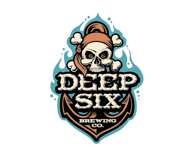
DEEP SIX BREWERY
by Logomotive • Uploaded: Dec. 05 '07 - Gallerized: Feb. '10
Float
(Floaters:
204 )
Description:
Logo for a beer brewery. Notice the d6 in the eyes? For a closer more detailed look see here. http://www.logomotive.net/en/closeups.htm Custom type.
As seen on:
www.logomotive.net
Status:
Client work
Viewed:
44,301
Share:


Lets Discuss
Your work is great but you do a great disservice to yourself and everyone else by selling it at such low prices.
ReplyThanks but what I charge is between me and my clients. You really have no idea what each contract is do you? It varies for each and the time involved.
ReplyGosh,what should I be charging? a million bucks? humm..**:-)
ReplyHate to sound like McDonalds, however,I'm lovin' it
ReplyMaybe I misread your site but it looks like you have some great work abut the pricing structure looked like it was based on a menu style scale with the top end being about %24150 per concept. My opinion is that work of this quality has a greater value, sorry that you clearly took it as an insult. *
ReplyMojo, thanks no I did take it as a compliment. It's just that I don't charge only 150 per concept at least not now. I'm a bit lazy for one thing and your looking at a page that was done in 97/98 (frontpage). I do charge a bit more than what you think but agree I could probably be charging more for my skill and knowledge. thanks for the approval.
ReplyGosh, I hope that don't sound egotistical?
ReplyNot at all, you've got some great work and sometimes might need to hear it from someone else, especially the illustrative work, which is something that a lot of solid designers couldn't touch. I'm really interested in some of your shading techniques, are they hand done or are using some filters to generate them i.e. the Main Street Sports Bar Shark?**
ReplyMojo, ha ha thanks. Hey I'll post on my shark to the best I can remember.
ReplyI like it very very much :)
ReplyYep, this one is off the hook!
ReplyFantastic.
Reply%5E%5E%5EThanks ha off the hook %3B-)
ReplyThis one makes me want to punch you.
Reply%5E Where's the gloves? I feel the same about a quite a few of your works, we'll just duke it out.
ReplyJust Beautiful mike :) Am a great fan!!
ReplyWow....... simply stunning!
Reply%5E%5E Thanks kind of you.
Replywhat detail! absolutely awesome work mike
ReplyNice to see this one resurface. A true master class.
ReplyAbsolutely brilliant!!!
ReplyThanks guys. D6 yeah loved doing this one.
Replyvery nicely done - I love this style!! Beautiful color combo.
ReplyI really like this one a lot.
ReplyJust for the record, this one is my fave of yours.
ReplyThanks Sean, one of my favs too.
Replyjust noticed the 6 in the eyes. sweeeet
ReplyThanks uneekGrafix, I appreciate the nice comment and honesty.I'll try to keep inspiring.*@mister jones thanks, good eye %3B%3D)
ReplyIts just ridiculous how good you are....
Reply:) thanks! I wish I felt the same.
Replyone of my favorites.
ReplyYeah it's really one of my favs also. In fact you just gave me and idea for an abandonded project. http://logopond.com/gallery/detail/77411 Thanks! maybe I could sell this one somehow.
Replyfantastic!
Replyi love this style
Reply%5E%5E%5EThanks :)
ReplyOh another great pirate here! Awesome work.
ReplyShame on me that I didn't float this one before..Great stuff mr. Mike..
ReplyARRRR thanks guys.
ReplyMikester...I mean Master!! This is just awesome!!
ReplyDefinitely one of my favorites on LP! I thought I commented on this already.. guess not.
Replyamazing label! Good beer?
ReplyMan, I'm always missing these Mike...%3Cbr%3EI mean jeeze...it's like a bottomless pit of tallent here... %3B)**I'll have to go trolling though the ol'showcase again and toss out some more floats!
ReplyI'm going to be honest with you Mike, I think you should retire. Best to go out on top, I always say. And I know finding work is rough, but you could always, say, teach. In the south. At Georgia Southern University. Mondays and Wednesdays from 3:30 to 5. **Think about it.
Reply%5EHaha, I'm with Chad!
Reply%5E%5EHa! Who wouldnt want that vacation schedual %3B)
ReplyHa ha, Chad. Awesome illustration, Mike.
ReplyKiller concept and killer execution. The attention to details, %22d%22 and %226%22 eyes is amazing.
Replyanother beauty. Your the king Mike.
Replynoticed on the website that the d and the 6 are just 6 and 6? Did you change it for that? anyway looks cool even with the grunge.
Replyfantastic work again!
Replyhappy to see this one featured!
Replyalways great Mike
Replyawesome work, Mike. true talent. great illustrative skill, man. love it!!!
ReplyThanks so much guys, I had a LOT of fun working on this one. *@mcdseven, yeah that was an earlier version and must admit can't take full credit for the d6 in eyes, that was Von's suggestion.
ReplyAmazing as usual!
Replyawesome work logomotive, really like this. *your damn good :P
Replyamazing illustration!
Reply%5E true story, i should make a page in my favorites just out of pieces from your showcase. :))
Replyyou definitley nailed this one!
ReplyInsanely great - I really wish I could do stuff like this. Inspirational.
ReplyGuess it%60s you Mike without viewing an author name%3D) Love your illustrative style!
ReplyAwesome!!! doing a beer label has been a dream of mine %3B) hope I can make it as cool as this when I get the chance.
ReplyThanks 2ccreative,Stephen James,Konrad,Lecart (Ha thanks bud),birofunk(came easy %3B),chopeh (you can),serhos (love yours too), and reno I hear ya I get inspired by many beer lables and wine labels in the grocery market, I satnd there looking like I'm thinking about what to buy but just studying the artwork, what a nerd huh?
ReplyMike, I commented on this years back, what happen?**It was heavy praise
ReplyRaja it was so special to me that I hid it and still treasure it today.
Replythat' so cute loll - but seriously, did you upload again or is this the original post?
Replyga ga goo goo, :) no I removed my entire showcase once for a while , another story.
ReplyBTW Raja, that was a compliment.
Reply%22Gosh,what should I be charging? a million bucks? humm..%22... it still wouldnt be enough... **I remember seeing this way back when too... I remember thinking %22I could never do that!%22... I still have that same feeling when I see it now... %26 I hate you for it...
ReplyOk Nav, how much I owe ya this time? yer breaking me brother.
Reply100th float, Tasty!!
ReplyNice work. I like the colors and the illustrative style.
ReplyNot to sound too forward but I would seriously consider baring your children. **LOVE IT.
Reply%5ELMFAO... jaysus Mike... so thats how you do it, design killer logos and ya can get groupies! @Ellie... your cracked!
ReplyI thought I have floated %26 faved it already?! Since I saw that I have a goal in live ...
Reply@mcdseven: Cracked - no. Eye for stella design - yes.*Hey, a girl's gotta throw herself at sheer talent when she sees it. Doesn't come around too often :)
ReplyYou know, I'm pretty talented myself...
Reply@Ellie... you gotta do what ya gotta do... and in fairness Mike is damn near King around these parts... oh and 'cracked' is used in positive tones where I'm from...! :)**
ReplyThanks guys, Ha ha interesting post how do I respond? guess I'll just tell ya Chicks dig me :) Thanks ellie %3B)
ReplyI'm a chick magnet.
ReplyGreat logos is the way to a cracked (?) girl's heart. I'm blushing just looking at it. To the other boys - Mike's some serious competition.
Reply%5E competition, nah! because I hope you appreciate the term 'beauty is only skin deep', because mike is really overweight (he put the muffin into muffin top), has the worst comb-over you ever saw, wears those horrible check trousers, has a glass eye, and I'm not sure if he still has all his original teeth? Actually he looks a little like Sloth out of the Goonies, but hey, he is a sh*t hot logo designer!
ReplyHey @mcdseven, you never know, that could be juuuuuuust my type. He can logo my motive any day. **Wow Mike, sucks to be your wall. (You've only got yourself to blame)
Reply%5E:). nice comeback.
Reply%5E%5E LOL
ReplyThis is killer... love your work!
ReplyTony, your just jealous chicks dig me %3B)*Jeffrey, thanks love yours too.
ReplyHey Ellie, check out my showcase, baby %3B)...Don't please, i could only dream of having this lads talent!!
Reply%5E Euan, it's my hot looks bro. I'm a chick magnet. Even at 41 :)))
Replyoutstanding! just that... congratulations! i would love to drink one of those haha
ReplyGreat job. One of the very best beverage logos ever.
ReplyThanks andrevalerias. Thanks McGuire.
Replyfantastic
ReplyI really want to buy one of their shirts because of the illustration. Simply sweet. Maybe this month :)
ReplyThaks Matt, Thanks Robert. Me too. good suggestion,I think I'll go do that.
ReplyOh. 41. With age comes spectacular talent I suppose. Muchos kudos again.
ReplyI LOVE YOU Elllie.
Replyget a room...
ReplyAlright, alright. My uncouth nature is wearing. Although, @nido, I just checked out your tasty illustrations...
ReplyOh give me a break guys, can't a guy get a little love ever now and again.
Reply:)*
Reply:) Thanks Ben.
Replyoooooo Very Good nice !
Reply%5EI'd like to see more. This is your best work IMO Mike, love this!
ReplyWhen I get a request for this type now. I'm getting 100%25 for my mark/type logo now. Plus Oronoz is hogging all the Illi type logos.
ReplyGosh! And this was done in what... 2007? With my illy background, you make me feel puny! :D A-W-E-S-O-M-E!
ReplySo, from what I gather - Mike gets the ladies - and Oronoz is doing all the work
Replybest
ReplyReally love the colors of this logo, type and the actual imagery.
Replyoh man ... your work is really special ...I'm a biiiig fan ...
Replysmart use of the d 6 in the eyes
Replygreat !!!! !
ReplyThanks for the love guys. Many of you have seen it, but this was made into a sign. Just thought I'd share http://dribbble.com/shots/274004-DeepSix-Sign/attachments/9820
ReplyInspiring
Replyfantastic!!
ReplyThanks James and Richard.
ReplyThis goes to favs. Great job!
ReplyMay be of interest.
Replyhttps://www.fiverr.com/jasminesarah/design-2-awesome-and-professional-logo-design
Thank you TwoTribes. FIVERR is becoming the biggest problem in our Industry. Say NO to Fiverr! need a campaign committee.
ReplyI'll gladly serve on that committee! And to further cement the universal truth of the matter, this logo is fan-bloody-tastic!
ReplyYou're on fiver? What are you going to do with all that income?
ReplyJerron, Yep! Quantity not Quality. I can produce a lot in 5 minutes for 5 bucks.
ReplyWow, that's an amazing logo!
ReplyThank You Sam!
ReplyGreat design made by a great designer.
ReplyThank you Alex.
ReplyPlease login/signup to make a comment, registration is easy