Cream
by tdf • Uploaded: Oct. 03 '07 - Gallerized: Oct. '07

Float
(Floaters:
34 )
Description:
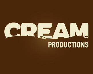
Proposed logo for Cream, a television production company. Comments appreciated.
Status:
Unused proposal
Viewed:
14629
Share:


Lets Discuss
very nice and neat mark..%0D*it convey the water wave.%0D*why bubbles are in the bottom? anti gravity?
Replythe type is halfway sinking into the cream and that makes some bubbles.*i think that's why they're at the bottom.
ReplyThe bubbles seem a bit small, but other than that, delicious!
ReplyBeautiful, though I might show a little bit more of the %22CREAM%22 text to improve readability.
ReplyGood job!
ReplyThanks everyone! The idea was that the cream was %22rising to the top%22. The bubbles just felt right at the bottom....
ReplyCheck out the final client approved logo:**http://logopond.com/gallery/detail/18723
ReplyPlease login/signup to make a comment, registration is easy