Niroche
by Mikeymike • Uploaded: Oct. 09 '11 - Gallerized: Oct. '11

Float
(Floaters:
74 )
Description:
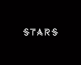
unused proposal for a knitting and crochet supply shop.
Status:
Unused proposal
Viewed:
13172
Share:

Lets Discuss
Nice work Mike :)
Replyhere it is ... like!
ReplyNice one.
ReplyI said that already on Dribbble, but this is great and I have to say it twice.
ReplyMatt, Bernd, Daniel and Milou thanks for the comments.
Replyoh man this is a beaut. too bad it's unused.
ReplyThanks Nathan. Yeah I was a little disappointed, I felt this hit the mark. Oh well not the first time or the last time client and I will not feel the same way about a design. But it is nice about sites like LP where you can still show the unused and get some feed back. It feels good when you get positive comments because it reinforces your gut that we might have been heading down a strong path with a design, but then again when you get a constructive critique and you see where you could have changed it and made it better, then you still win in the long run. enough said. %3BD
ReplyMega like. Beautifully integrated needle.
ReplyMega thanks, JP. :)
ReplyLove it Mikey!
ReplyYeah, real nice, type, Mike!
ReplyThanks Mike, appreciate it.*Sean always nice to hear your on board too, man. cheers.
ReplyLefty, must of missed your comment while I was typing out Mike and Sean's message. Thanks my friend. always nice to get your insight.
ReplyGood idea, concise!
ReplyCute letters, Mike!
Replythanks, Artgeko.*Big thanks coming your way also, Alena. :D
ReplyU P D A T E D ! Cleaned up a bit around the area where the needle goes through the %22h%22. think it helped. cheers.
ReplyVery nice Mr. Mike... And very interesting for me because I had very similar idea/thinking (now rejected) for Kaftan...
Replythanks for the comment, Muamer. but sorry to hear you got the same reject letter I did. :D Oh well, it was a nice direction, and I'm sure yours looks great. cheers.
ReplyAnd thanks for the floats. feels good when you think you've made a good design, but the client disagrees, but all least fellow designers make you feel like you ARE on to something. Reassurance I guess, keeps us in the hunt. :D*THX
ReplyThis is outstanding Mike. Expect nothing less from you. This is waaaay too good for the business imo. Did you see the final clipart one they ended up with?
ReplyYes I did see the final. Mad my sick.*thanks for the compliment though. cheers.
Reply%5Eopps.. %22MADE me sick.%22 well mad too. :D
ReplyCongrats on the gallery spot Mikey! I will upload my rejected version a bit later just to show you how we think alike... (I don't know your timing - my version was made sometime in the previous week :)) Hey, designers similar thinking is always interesting, but what makes this much more interesting is that both our ideas has been rejected by two different clients!? %3B)
Replyi'm just curious...are you guys doing 99 design contests? because it looks like that is where the winner was chosen and you both are so much better than that site.
ReplyHere is my version :) http://logopond.com/gallery/detail/149481
Replyoh and btw...congrats mikey.
Reply@Colin: Don't know about Mikey but I'm not there :)) These are two different clients...
Replyi understand that now, i thought you meant rejected 'niroche' version originally. the question still stands for you mr. mike.
ReplyNice one Mike!
ReplyAgain, beautiful mark here too, Mike %3B-) Yeah, I saw the logo the use now, I think it's definitely about personal taste. That country likes a more %22ornate%22 graphic I think. But you did a great job with this one.
ReplyWow, this thread got a whole lotta weird quick, I'm really confused.
ReplyMike, nice colors.
ReplyHey Colin, yeah ya caught me. :D I did do some of the contest online stuff for a year or so, before I was on LP. I didn't go there because of the money, I did it because I always had a passion for logo work, and just hadn't had the opportunity to get many projects. And even though I would do a logo for %22just for fun%22 once in a while, it wasn't the same as having a brief and being challenged to create something that has rational behind it. Logos need to make sense to the audience it is intended for. And they have to also have meaning to the brand of the company or service. And those briefs (although mostly not written too well) gave more challenge to me.*So even though sometimes I never even ended up entering, just took on the challenge and tried to design to it, I sometimes never turned them in, I did them for myself. But I did enter some. Most of those companies that have their logos made through the contests or from the %22Logos for %2445 and up%22 site, really don't know the value of what a brand or logo really does for a business and never will. Most of them will never make it past their first couple years of business anyway. And I know that. But I did for me to just feel good about doing something in logo design. *Then I got introduced to Logopond and Dribbble and have not done any contests since. I get enough referrals from LP to keep me happy. Even though only about 10%25 of those turn into a actual project, but that's okay. I just find that getting feed back from other designers on this site gives me the challenge of making sure I'm creating something that makes sense and is a solid design, which feels good.*I don't agree with the %2445 Logo web sites or the contest sites, but lets face it, they aren't going away. Mainly because there are always people out there that don't know (and never will) the value of what a strong brand or logo development means for a company. And therefore don't really understand their customers and therefore won't usually last to long in the real world anyway. So they cut corners and go for something cheap. IMO.*Sorry David for writing such a long reply. I know there are forums here for that. but just felt I wanted to say something.*I love why you created this site and it is such a great place for a designer to get on their feet and improve their work, so keep it up.**Cheers.
Replymike, regardless this is a beautiful design. i understand and have to admit that while in college i created a 99design account. i was ignorant of the stigma that spec work brought to our community. i now realize how invaluable sites like logopond and dribbble are. it makes me feel good knowing a designer of your caliber (the john lennon of logo design) is still willing to grow and enhance their skills %22just to feel good about doing something in logo design.%22 i can only hope that one day potential businesses will understand the grueling process of branding so that our profession will continue to flourish.
Reply%5E agree.
ReplyContests or not, Mikey - you rock!
Replythx, Muamer. Liked your design by the way.
ReplyGreat calligraphy, and very to the point design. Its really a pity that this sign did not go into use. And regarding 99design and other sites of the sort: I think that they destroy the profession, and I have a lot against them, but hell I still do those contests If nothing else comes around. Sadly, I think more and more work will go through this channels, simply because most clients don't give a flyin f about good design.
ReplyPlease login/signup to make a comment, registration is easy