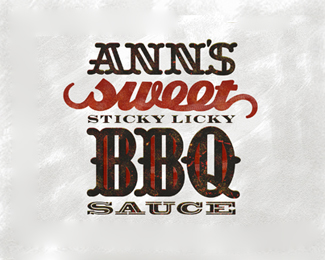
Ann's BBQ sauce_2
by Mikeymike • Uploaded: Sep. 30 '11 - Gallerized: Oct. '11

Float
(Floaters:
70 )
Description:
WIP. another approach to the BBQ sauce. type is a tad small, but I don't intend on running this ever too small in size. thoughts?
Status:
Work in progress
Viewed:
15898
Tags:
pork
•
beef
•
chicken
•
seal
Share:


Lets Discuss
this is turning out nice, mike.
ReplyNice touch with the grill running through the letters in BBQ.
ReplyThanks, Colin.*And thanks also to you Mr. Brown. Yeah you are the first one to notice that connection. Its custom type that I hoped would give the feel of a thick grill rack. (:
ReplyMuch better. Nice retro feel.
ReplyI really like the colours in this one but I like the other version better Mike. Personally not too fond of the starburst as the final outer ring. Maybe another circle outside of that? But what I really admire is how you have solved the 'Long Name Logo' problem by incorporating different font sizes. I read Ann's BBQ Sauce straight off the bat but can also see Sticky Licky as well. Almost like an aftertaste effect. This is visually tasty bud.
ReplyJP, appreciate the comment. cheers, man.*Chanpion, still toying with it, but I think its getting close. might be right on the outer edge, just thought it reminded me a bit of a fire ring or gas burner anyway, looking straight down at it. Have to show all my concept directions soon, so I hope the client likes the direction. thanks for the comment. And yeah long names are a b@%23%25%24 to get to look right. (:
ReplyDavid you can see a larger image here. Just click on the attachment right below the main image. The colors are a bit different, but close. Still tweaking those.*http://dribbble.com/shots/281494-Anns-BBQ-Seal?list%3Dfollowing
Replyactually a better view here.* http://dribbble.com/shots/281494-Anns-BBQ-Seal/attachments/10496
ReplyI like it, but I think the type only solution is much stronger. It felt like an old, down-to-earth, nitty gritty woodtype poster with the different typefaces and different colors. I think here there is just too many competing elements and the overall feel of the identity is not as clearly defined.
ReplyFantastic Mike!!
ReplyAmazing. Reversing this out and the colour change made this so much better. Clever thinking there Mike.
ReplyLoves animals in fire! what will be colour of bottle?
ReplyLooks good and interesting, but I like the other version better.*I would increase the leding a bit for better readability, and maybe make %22sticky licky%22 regular instead bold.*Nice touch with animals in fire :)
Replythanks everyone for the comments and feed back, helps a lot. cheers.
ReplyLovely work Mike! I like!
Replybrilliant!
Replyyou're killin' it recently with these gallery spots. nice job mike.
ReplyGALLERY! didn't see that coming. Thanks.*Bart, thanks, man. really like your showcase by the way.*Bernd, you da man. cheers.*Same goes for you to Colin, appreciate the kind words.
Replypork, chicken, beef...i am so hungry..:)
Replythis is cool!
Replynice
ReplyGreat details.. love it
ReplyI love the feel of this.*
ReplyDeividas, I hear ya, and Ann's Hot BBQ sauce is great.*Gary, Michal, logo design and Jessica, thanks for the comments.*I hope these design gets there, hope to show the client this week.*cheers all, and thanks for the floats.
ReplyMike, this is pretty awesome. I'm having a tough time deciding which I like better. Your all-type execution does have that old-style hot type feel, which is pretty awesome in its ruggedness. And this seal, well, I frigg'n love seals. Yes, there are a log of elements going on, but I'm not having any issues of elements competing with one another. My eyes go directly to the name, then my eyes wander around, taking in all the secondary elements - which is how it should be.**So, great work! Can't wait to see which direction your client goes for.
ReplyNIce! Float!
ReplyThanks, Jon. Hope the client likes the direction also. I may talk to them about using this on the top of the jars and then go with the type on the front label. That way they could change out the front for her hot sauce and or any other flavor. We'll see. thanks for the comment.*Ryan, glad you like it. cheers.
ReplyReally nice Mike (as always). I know you said that this logo is displayed at a smaller size than it would normally be, but your inline openings in the word %22SAUCE%22 are closing up. You might want to consider a solid font instead.
Reply%5Eagree.
ReplyBBQ saucee (drooling like Homer:)*Really nice logo Mikey!
ReplyVery nice indeed. All fits nicely!
ReplyThat's hot Mike!
ReplyRokac, Gouraud, Hertz and Sergey thanks for the thumbs up. Means a lot.
ReplyAwesome!
ReplyTHX, John!
ReplyPlease login/signup to make a comment, registration is easy