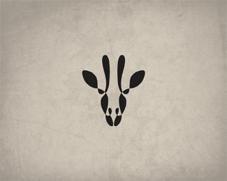
Alefant
by Jurcek • Uploaded: Feb. 25 '11

Float
(Floaters:
21 )
Description:
Self service wash systems. Did u notice letter "a" in the mark?
Status:
Nothing set
Viewed:
9489
Share:


Lets Discuss
Can't say I noticed the %22a%22 in the mark, but I can say I noticed the uncanny resemblance to this logo:*http://logopond.com/gallery/detail/129874
ReplyOoops, I meant this logo: http://logopond.com/gallery/detail/114356
Replywell they're both elephants spraying themselves with water but i think they both have their differences...
ReplyHmm, have to agree with Steve here. Yes, both are elephants who share the same kind of standpoint / position. Even the choice of neutral colours looks a bit of the same.**However, I think the combination of type and mark really works well here. I also think that if you rework this mark just a little bit more, you could have an original gem here with even smarter use of the negative space, because I can't find a clear 'a' in there either.
ReplyOther then that, I still really like this logo.
ReplyWho cares! Overall they are both great logos done very well! I mean I see both sides of the story but, I think there is no problem! Keep it up man!
Reply@nps152 - Who cares? Well, possibly the designer of the other elephant logo for one. I'm not saying that this is a direct rip of the other logo, but they are remarkably similar in both subject matter and style, wouldn't you agree? I've personally had logo designs either stolen or %22borrowed%22 in the past and being on the receiving end isn't much fun, trust me.**With that said, this is a great logo, as is the other logo - I'm not arguing that. But the similarities between the two logos just seemed a bit close to me. If both designers don't have an issue with it then enough said.
ReplyI didn't care for the first one, now there has to be another?
Replyi honestly apologize to mateusz turbinski..i never ment to steal or barrow an idea from him..i saw his logo for the first time. im gonna rethink the whole concept and design a new, different logo..no offence.%0D*@jerron tnx for the support..
ReplySo why thank @jerron?
ReplyYours is better by the way.
Reply@cresk its called sarcasm..
Replyboah - what a great mark ...
Replynice buddy :) love the logogram!
ReplyElephant is great, simple and clear :)
ReplyPlease login/signup to make a comment, registration is easy