Return To Action
by Kalli • Uploaded: Feb. 09 '13

Float
(Floaters:
1 )
Description:
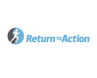
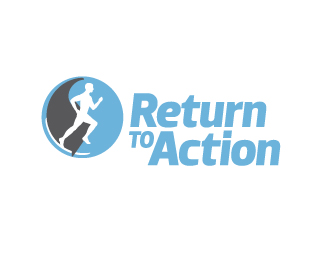
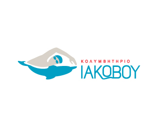
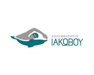
Exercise programs for body-fitness and also for therapeutic treatments - physiotherapy.
[Personal notes: The client specifically asked for a mark that uses a human figure. The logo needs to reflect the active/energetic nature of what it promotes, but also have a gentle and relaxed feeling to reflect the therapeutic aspect too. There are some subtle references in the mark of the yin-yang symbol ("balance") and an arrow formed by the grey shape ("return", "moving forward" etc).]
I'm not sure how i feel about this, I've been working and reworking on it, and brought it to a stage that I feel retouching it even more will ruin it, but still not too sure if it feels complete, so comments are welcomed.
Two variations.
Status:
Work in progress
Viewed:
877
Share:
Lets Discuss
Please login/signup to make a comment, registration is easy