Iakovou Swimming Pool (swimming school)
by Kalli • Uploaded: Aug. 28 '11
")
Float
(Floaters:
6 )
Description:
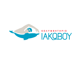
Logo for a swimming centre, that offers mainly swimming lessons for children and some aquatic-fitness programs for adults.
The wording is in greek, the swash-like wave under the middle 'O' is replacing the horizontal bar of the greek letter 'omega'.
Kinda stuck, so critiques are welcome! =)
Status:
Work in progress
Viewed:
3477
Share:


Lets Discuss
I like the symbol and the type. Would try a blue instead of the greenish-blue color, and a lighter gray.
ReplyWow, my first ever comment! %3D) Thank you!*I tried a few versions with slightly different tones/shades, I can see it now that the swimmer needs a more lighter gray. Thanks for suggestions! The client has asked me to possibly throw in a more dynamic/energetic colour too, like red or orange... but i honestly can't see how that can happen, thats why i'm kinda stuck too..*
ReplyI am happy that this logo status is WIP
ReplyIn love the idea of the dolphin/swimmer mark. Maybe eliminate the goggles and cap on the person and just go all grey? The overall composition seems like it could be improved too. Great work!
Reply@lumavine, happy u like the idea! Did try it without goggles %26 cap but client didnt think it felt like a %22proper swimmer%22 if u know what i mean..*Appreciate everyone's comments %3D)*Just a uploaded a new file with small changes..
ReplyWhy should it be a 'proper swimmer' if they are targeting casual swimmers like children and adults looking for an exercise activity? Maybe if it was a pool for Olympic training. Have you tried the glasses in white (cut out of the shape to show the background through)?
Replyhmmm actually i do think that goggles %26 cap relate more to a swimming pool, without them he looked like he could be swimming in the sea too..*In this coloured version (actually not this one here, but the other file I uploaded) I tried the 'cutout' goggles but he looked a bit creepy %3DP*But the cutout goggles really work better on the monochrome version I made (black, or white in case of dark backgrounds) as secondary logo for any printing difficulties. %3D)
Reply%22What does that mean?%22**It means that I love this logo idea, but in my opinion execution is a bit weak, can't wait when I will see final version of it. Wish you luck Christina, I like the way you are going!
Replyyep, this is definetely in early stages, happy u like the idea paul!
ReplyPlease login/signup to make a comment, registration is easy