PARKZONE
by nanette235 • Uploaded: Apr. 22 '10

Description:
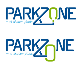
PARKZONE (PZ) is a parkingcompany.
The pay-off in logo is in danish - means: - we create space.
With that in mind i created 2 version of a type based logo using the Z as a 'road'
leading to an open space in the O
The colours, are not the final, but will be in blue and green, where as before it
was in blue-yellow. Why I chose green, is that i wanted PARKZONE to be a company,
that is more than just a 'parking ticket'.
- by adding the green colour - was to lift PZ into a more friendly and service-minded
direction. Plus the green indicates - free space.
I would very much like feedback on both logo variations to hear about what you
think - what could be better and which one you think is the best.
about the type - is it to rounded? should i add round corners all over?
Status:
Client work
Viewed:
494
Share:
Lets Discuss
Please login/signup to make a comment, registration is easy