Personal Mark
by mattkauz • Uploaded: Jun. 19 '09

Float
(Floaters:
7 )
Description:
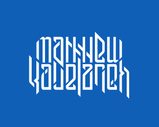
I struggled with developing a personal mark for the longest time, until my graphic design professor gave my class a project of developing our own superheroes and marketing them. I wanted something bold that matches my design style, yet I wanted to simple and memorable at the same time...
I ended up developing this mark, a breeding of the letters "M" & "K" (my initials) into what I think is a very strong personal brand...
I would love to hear your comments and get some feedback! Haha, and I'll also take typeface suggestions as well! :)
Status:
Student work
Viewed:
5100
Share:


Lets Discuss
I see the M clear as day, but the K isn't as apparent. I like the direction you are going in though. Nice work!
ReplyThe M is great%3B unique and memorable. I didn't see the K. I tried seeing a shape under the M, and I thought there was an homage to Batman.**Love your portfolio, keep it up.
ReplyWell, let me see if I can help you both out... the %22K%22 is connected to the center joint of the %22M%22. If you still can't see it, try tilting your head to the left.... Ahh, you see it now?
ReplyI saw the K from the start, it was just not that clear. If you had not told me in your description that it was an M and K, then I would have never known to look for the K. Still a cool mark though!
ReplyI didn't see the K immediately. Once I knew it was there, it was easy to find.
ReplyI like it very much...I wouldn't fret over the %22k%22 not being as visible.
ReplyPlease login/signup to make a comment, registration is easy