Brandchimp
by EnGar • Uploaded: Mar. 17 '10
Description:
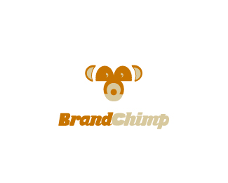
Web design / development company, from design to marketing and branding. The chimp has a B (eyes part) and a C (around the mouth).
Status:
Unused proposal
Viewed:
3268
Share:

Lets Discuss
Hi everyone, this is a first draft and I'm looking for some constructive (or destructive if needed) criticism, thanks.
ReplyAny comments? :) thanks...
ReplyJust my two cents: It definitely has potential, but I think the copyright c is only distracting. Plus, you've already split up the name by using two colors, so for my taste, one font would do.
ReplyThanks Barry, I'm working already on another version and I'll keep this in mind :)
ReplyGood, I regret having used the expression %22has potential%22 because it is very nice now. But you know, if you look at a logo in %22review mode%22 you focus on the details that might be improved.
ReplyThank you :) I really like it, and I would like to perfect it, however client decided to go a bit more cartoonish so it will have to wait a bit.**New logo is here:**http://logopond.com/members/profile/showcase/32453**And thanks for your floats :)
ReplyUpdated after some months :)
ReplyI think it doesn't look like a racoon anymore %3E.%3E Just saying.
ReplyPlease login/signup to make a comment, registration is easy