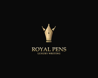
Royal Pens (2)
by andreiu • Uploaded: Mar. 13 '10
")
Float
(Floaters:
101 )
Description:
A new version for Royal Pens. Your comments regarding the other version lead me to this. Special thanks to Mike.
Status:
Student work
Viewed:
27313
Share:


Lets Discuss
nice, additional details have done their job, now it is more noble :)
Replyawesome concept and execution, congratulations to do such a logo.
Replycheers guys. Jan, that's a nice compliment. many thanks.
Replyabsolutely stunning...g8 update on the other concept andreiu...dig it
Replynow it's perfect.
ReplyJackpot:) That's a beauty Andrei!
ReplyThere you go, nice!
Replyjust awesome!
ReplySo much better.
ReplyThis is ten times better IMO.
Replythanks a lot guys!%0D*@Mike: many thanks for your support. i got here after thinking about your comment you wrote on the other version. you sure were right when you said it looked more like %22Pope Pens%22. so i thought i can do something better. thanks again.
ReplyAnytime, glad to see such a wonderful improvement.
Replyluxury logo!
ReplyWOW. this took it up a notch in my book. and it was a great concept the first time around.*Nice, very nice. classy.
ReplyLets criticise this version and see what he will come up with
ReplyABSOLUTELY STUNNING PIECE OF WORK!!
Reply@Miska, @Mikey, @Almosh: thanks for your support! glad you like it.%0D*@duhbra: lol. i don't know what would i be able to do about that. :))%0D*@david: oh yea! though this one's way better. :D
ReplyVery nicely done...very classy mate!
Replywonderful job in retouching this concept, love where u've taken this
ReplyThis is GREAT Andeiu!
Replywow Awesome!!
Replycheers guys! i am really glad you like it. i'll probably post a %22how it's made%22 article for this one on my upcoming blog. :)
ReplyIt would be gr8 I am looking forward.
ReplyHot stuff Andrei!
Replywow! thanks guys. i'm pretty impressed this one got as many floats as the first version, considering first one got in the gallery. cheers!
ReplyHow did I not see this? It's stunning! :)
ReplyThis is great work Andreiu.
Replythanks a lot Josh and Joe!
ReplyMy favourite. Same here as Anthony, would appreciate to take a peek at your MO.
Replyawesomeness..
ReplyThat is really nice. I like this one better. Good perspective and details are amazing.
ReplyGREAT idea!
ReplyThis is awesome. I prefer this to the first design. Great revision!
Replyvery much appreciated! thanks for all the floats and comments.
ReplyImperial work!
Reply%5E it is indeed. and it is amongst the few logos i know to gather up over 70 floats without being int the gallery.
Reply%5E Lecart, I just wanted to point that out. I'm impressed to see this logo got so many floats without being spotted. thanks mate!
ReplyValue is important, adding to the gallery no matter. We see things logos in the gallery, but they floats is it?
Replyimpressive update here
ReplyAwesome mark - though the company name 'royal pens' is strange? It could be something more abstract and the mark would be strong enough to get the message across re. what the company does. Still awesome though.
ReplyThis is a fav.
Replyfrumos logo si faina galerie, felicitari %3B)
ReplyGreat W!
ReplyThis is stunning! The detail on the pens is undeniably perfect.
ReplyPlease login/signup to make a comment, registration is easy