EJARA ONE
by Nitish • Uploaded: Mar. 09 '10 - Gallerized: Mar. '10
Description:
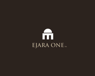
Final look for an islamic bank. Not approved by the client...:(
The mark is a combination of E and O, forming an islamic building.
Status:
Unused proposal
Viewed:
8774
Share:




Lets Discuss
I like it :)
Replyi only see an M. no E, no O.
Reply@ anderiu the e is rotated 90 clockwise...wid the O forming the dome...not everthin has to be that obvious...**@ koodoz..thx bud
ReplyI like it, nice and simple. What font is that if you dont me asking?
Replyhey thx compass..the font is trajan pro...:)
ReplyThanks, i really do dig the design. Also if the middle of the %22m%22 was a darker shade it would look like a 1.%0D*
Replyobviously i saw the rotated E, but it's a very unhappy coincidence that the rotated E looks like an M. just think of the targeted people that do not analyze the logos like we (logo designers) do.
Replylet me xplain...tr is a deper meaning to the concept - The word ejara is an arabic word that simple means an islamic bank. so my representation of brand initials to form an islamic building makes more visual sense to anyone lookin at it, then finding out the mystery behind the conflict of e AND m.* **
Reply%22 just think of the targeted people that do not analyze the logos like we (logo designers) do.%22**...well i guess they just wont be analizing it then... simple.
Replythen don't even mention the 2 letters in the description. :p
Replywel thats were the concept came from..E AND O..get it andreiu.:D
Replysimple n great... :)
ReplyThis is great work bud.
Replyyup it's cool nitish.
Reply@sbj, joe, milou..thx a lot felowz..:d appreciate.
Replysimple and strong.
Replythis is good logo, but if for islamic bank i think they will more prefer have the symbol of moon.
Replyjust my opinion, anywhere i like this logo
ReplyReally stands out, my sort of design, clean and simple. Good job.
Replyvexeen, graham...thx a lot feloz..:)
ReplyGood fell.
Reply%5E thx mr webcore
ReplyI really like it a lot! :)
Replythx dude...:)
Replyis this for sale?
ReplyPlease login/signup to make a comment, registration is easy