AT ver2
by Logomotive • Uploaded: Feb. 16 '10 - Gallerized: Feb. '10

Float
(Floaters:
87 )
Description:
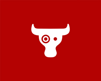
A wild version of Animals Today. A bit too wild I think.WIP..
Status:
Unused proposal
Viewed:
12195
Share:

Lets Discuss
Cool, Mike. I like how you have been handling these. A bit of a Chermayeff %26 Geismar feel to them. Good stuff.
ReplyThanks Sean,I have five animals in this one ,but not liking the elephant just yet, I think it's the little hump between nose and trunk I need to add.
ReplyI think I muffed it up, looks more like an elephant but lost some aesthetics.
ReplyYeah, the elephant is looking a bit squidish. Now, wait, what's the fifth? I see fish, deer/antelope(Ram?), Swan/duck, elephant and...?
ReplyWell you just said it with squidish %3B) back to original.
Replylooks great Mike, spotted them all.., super stuff brother, hey maybe you can to a version of Logo Designers / Graphic Designers today... I'd be the fat one with the glasses.
ReplyHa Ha Paul, thanks. Would make a funny logo because we are all a bunch of nuts.
ReplyI see a fish, mouse, eagle/bird, swan, and an elephants trunk. Did I miss anything Mike?
Reply%5EOne of those whatever you wanna see logos. Client came back with the comment %22trippy!%22 I thought the same about it.
Replyhaha %22trippy%22... love it...
ReplyHey now! Trippy indeed..! I dig it! %3B)
ReplyThere's a lot of animals in there, sweet work
ReplyI just wrote a semi-lengthy comment about the elephant being a bit off, then went back and read the previous comments. Then backspaced. **I'm not sure I'm as big of a fan of this one. As a designer, I think it's incredible, but I can't help but thinking it would be a little hard to interpret right off (to the average passerby). Maybe a completed elephant will pull it all together. Good luck!
Reply%5E yeah I agree. They are pretty set on initial one anyhow and I think it's more appropriate. I hear ya 100%25 Thanks.
ReplyThanks Nav, Ceris and Michael %3B)
ReplyIt%B4s amazing, when I thing you can%B4t have other concept...just because your original concept is perfect...you arrive with this......i%B4m in diapers
Replyhahaha %5E i don't think i could have put in so eloquently, but i agree!
Replylove love love love *This is brilliant
Replyand you have my bow... float I meant float.
ReplyAnother great logo! I am delighted with the embodiment of images! Fantastic!*%3B-)
Reply%5E Actually, it does: http://logopond.com/gallery/detail/94204 Mike said so. :)
Replymagnific.
ReplyThanks guys, I'm surprised some like this better to be honest. I think it's a bit too %22psychedelic%22 or 'trippy%22 The other is straightforward and better balanced IMO. But That's why we design different options right? Thanks for your comments.
Replyyea I like both but prefer the other most non artist probably get the other one better.. Either way it's a picaso
ReplyTony,Thanks This may come in use in future.*Thanks Steve yeah that's probably why they did not bite on this Picazoo
ReplyI'm not as much of a fan of this logo as I am others. Doesn't really strike animals for me
Replybow to you master!
ReplyI see Woodstock from Charlie Brown (Peanuts) in there.... nice one.
ReplyI like it... but please centre it!
Replystunning integration mike
ReplyEven though I like the other one better, they are both genius.
ReplyThnka guy.*@ XM HA ha Wooodstock Totally! even funnier now I see that and relate to Woodstock %22trippy%22 ha ha.
ReplyI like the end result of this version!
ReplyThis should really be the new logo for Animal Planet. It has a bunch of animals and is the shape of a planet. Ching, ching. :)
Reply%5E couldn't agree more. i don't like at all the current Animal Planet logo.
ReplyYeah, I totally agree %5E%5E%5E*Animal Planet logo is super bad bad.
Reply%5E%5E%5EHa! I'll 3rd that... %3B)
Replycool
ReplyBrilliant, this must have taken quite a few scamps to get the right shapes
Reply%5E yeah Animal Planet, I can totally see that. Thanks guys, client chose other and In use now.
ReplySO inspired...! I see 4 animals:%0D*1 fish%0D*2 swan%0D*3 goat%0D*4 sea-elephant (elephant seal)
ReplyWOW
ReplyThanks%5E%5E, the other animal was just an octopus tentacles, guess that never came out.
Reply%5Estill the best logo designer by far...
Reply%5E How much did you say you wanted?
ReplyNice job!
ReplyThanks Robin, yeah still trying to sell this to Animal Planet :)
Replydefinitely would watch animal planet with this logo :D
Replygood !
ReplyThanks action and jands!
ReplyPlease login/signup to make a comment, registration is easy