be creative v2.0
by Phane • Uploaded: Nov. 12 '09

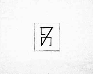
Float
(Floaters:
40 )
Description:
I added some motion to it... I hope is more original now because I really like this concept.
Status:
Student work
Viewed:
9890
Share:


Lets Discuss
i like it too... is it vector?
ReplyYes... it's vector :)
Replyinteresting one..creative and original
ReplyMuch more original now. :-)
Replynice one phane. truly original :)
Replyyep... thanks for critique. sometimes it's not enough just a sparkle
Replyrealy great!
ReplyGreat recovery
ReplyGreat energy!
Replynice change here! :D
Replyi think with some small touches you could really stand this off a page. Not sure how exactly, but maybe have a go at adding some dimension to it to make it pop out.**looks great dont get me wrong but I could see this mark really making some waves if it was pushed a little further.
ReplyReally nice effect! :)
ReplyGreat work!
Replyvery cool, looks like it would've been painstaking! Awesome
ReplyThought I commented on this. Nice progression to this result. Very unique effect you've placed on this and it would still look good in one color.
Replythank you!
ReplyVery nice indeed. One thing that (sort of) sticking out for me is a straight shape of C's left vertical stroke .. the rest of the logo is very fluid and organic, but this part is very rigid and unnatural looking. Perhaps just add a bit of a curve to it ?
ReplyI've never seen anything like this before. Pretty unique I think.
ReplyThanks , appreciated! @epsilon... sorry mate... i really can't see what are you talkin' about :) You say that the C should be more rounded ? Not having straight line on left ? because if is that , i actually like it this way.
ReplyYep, the straight line is what looks odd. The logo looks organic and spontaneous, the straight line somewhat sticks out because of that.
Replyvery nice logo,*good balance and great colors...brilliant..!
Replyvery nice logo,*good balance and great colors...brilliant..!*try one with black background....
Replyvery nice logo, good balance and great colors...brilliant..!*please try one with black background....
ReplyPlease login/signup to make a comment, registration is easy