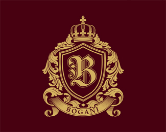
Crown Bank v2
by Logomotive • Uploaded: Nov. 05 '09

Float
(Floaters:
32 )
Description:
Stacked version of final chosen logo.
Status:
Client work
Viewed:
6079
Share:

Lets Discuss
The two horizontal lines look a little too thick, IMO. Looks really nice otherwise.
ReplyI have confidental feeling about this ... one hundred stability, stronghold, ... / zero emotion, fun, ... I am fascinated by fact how variable your logos are.
Replyamazing..so simple, elegant and powerful.
ReplyVery nice.
ReplyThe queen would be proud.
Replygood one!
ReplyLike this version even better. Not sure about the gradients %22inside%22 the crown though.
ReplyThis is great Mike!!!
ReplyThanks guys.Thanks !mude only used in some cases mostly one color. I like it personally conveys that puffy stuff inside crown ,whatever its called.
ReplyPuff Diddy?
ReplyHehe, yeah I totally see that and I kinda like it too :) It just feels stronger without it I think. But it's definitely a very nice alternative.**Is there any chance of seeing it in action - is it live on a website?
ReplyNo Not yet.Logo comes first right :) the right way to do it. Bank will be in Belize though. Will update when more info is available.
ReplyI wouldn't change anything. I really like this.
ReplyA beauty - with the puffy stuff!
ReplyThanks Michael and Muse.
ReplyPlease login/signup to make a comment, registration is easy