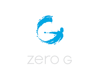
Zero G
by eltrev • Uploaded: Oct. 24 '09 - Gallerized: Jun. '10
Description:
This was chosen by the client from gawd knows how many concepts. Two fun aspects of the project were: 1) designing a branded airplane exterior, and 2) turning on the news one day to see Stephen Hawking wearing my logo :) - http://bit.ly/nasa-images
As seen on:
NASA, Sharper Image, CNN, ABC, Nova, gozerog.com
Status:
Client work
Viewed:
18362
Share:





Lets Discuss
Very cool mark, Type needs to be as good.
Reply%5EI agree with mike. Great mark.
ReplyGreat mark, a perfect combination of accidental stroke and a well thought out Brand, I have to agree with Mike about the type, they don't seem to be married just yet, great job so far.
ReplyBTW cool to see your logo out there. The Mark is out of this world. Hope to see it on FP.
ReplyWoa .. this is truly awesome
ReplySweet logo. I'd love to go on one of those flights.
ReplyThanks for the nice words, nice people. I agree with the typography crit - I didn't want type at all. This final was my way of getting as close as the client would allow to making the type %22go away%22.
ReplyI love seeing logos in context, in this case I see that they work better when separate as per the airplane, they look great that way IMO, again, great job.
ReplyNice work....looks great on the nasa site.
Replymark is great! dont like type
Replynice mark.. well executed
ReplyGreat work on the mark!!
ReplyLove the mark! At first glance, I thought it's related to surfing (I see a man and a wave at his back) Nevertheless, great job!
Replyamazing mark, you should work on the type imo
ReplyI don't see anything wrong with the type. Sure it's not overly designed and modern like so much of the recent custom/customized type on the Pond, but it works. It's supposed to be subtle while letting the mark do all the talking. If anything, I would have made it smaller in relation to the mark.
ReplyBeaut of a mark agree keV on a tad smaller logotype
Replywow, excellent design.. i like it .. totally unique concept..
Replycooooooooooool beans man*
ReplyPlease login/signup to make a comment, registration is easy