La'kiru WIP
by alterego • Uploaded: Sep. 23 '09 - Gallerized: Sep. '09

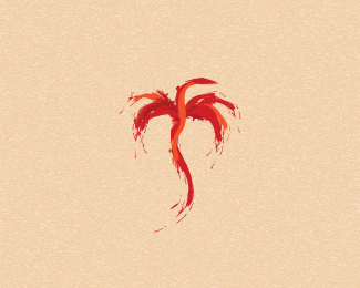
Float
(Floaters:
32 )
Description:
Fashion shop
Status:
Unused proposal
Viewed:
8545
Tags:
alterego
•
alter ego
•
alteregologos
•
shylesh
Share:


Lets Discuss
Love the mark. Maybe the type should be the darker rust color. Feels too top heavy.
Replythanks mate
Replyi love this mark :D
Replythanks guys.... plz chk this version too...**http://logopond.com/gallery/detail/78658
Reply:( client refused both options
ReplyBeautiful mark dude.
Replyah sweet! dude its the clients loss! what a mark!
Replygood logo
ReplySweeeet
ReplyI like the other version. But I think i like this too.. simple. But I agree with Logoboom, a darker color for the type will make it look balanced. %3D)
ReplyVery nice, great mark.
ReplyShame about the client, this looks great!!
ReplyPlease login/signup to make a comment, registration is easy