by sbdesign • Uploaded: Aug. 07 '09 - Gallerized: Aug. '09
Add to Pad (In 71 Pad s )
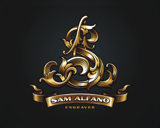
Description: Interior Salon Status: Unused proposal Viewed: 24407 Share:
I don't think you need to extend those amazing effects to the type. The D is wonderfully complex and elegant.
fancy!
Great details!
Yeah great detail work.
Wow! Amazing and classy!
Elegant and classy, this is perfect!
Veri interesting mr. Don't warry about L'bar )
incredible detailing :) kudos :)
this is sweet piece
wow! great attention to the detail!
Great D! But i thik that the distance between characters is too little, it's bad influence on the readability.
The big D is sweet.
So Great!!
really great execution
I agree with chirp. I'd like to see it without the bevel effects on the name. That big D is just so fantastic, it shouldn't have any competition!
Wow. Beautiful.
Beautiful!
Very nice. Amazingly Beautiful. Love the classy feel and details in it. Nice.
love it!
nice ornate work
Absolutely beautiful! Totally caught my eye.
impressive
WOW
quite nice and appropriate
can't wait to see it real thing... metal and copper :D*good execution!
This is sick, simply incredible
Superb!!!!!
Thats Awsome
I'm working on a similar logo but with an %22e%22 instead :o amazing, where did you learn to ornate like that ? i saw an engraver site to learn the ornate thing :o
damn nice!
Very Zhoosh... :)
amazing work
Really great execution.Amazing and classy!*Superb!!!!!
Please login/signup to make a comment, registration is easy
Follow


Lets Discuss
I don't think you need to extend those amazing effects to the type. The D is wonderfully complex and elegant.
Replyfancy!
ReplyGreat details!
ReplyYeah great detail work.
ReplyWow! Amazing and classy!
ReplyElegant and classy, this is perfect!
ReplyVeri interesting mr. Don't warry about L'bar )
Replyincredible detailing :) kudos :)
Replythis is sweet piece
Replywow! great attention to the detail!
ReplyGreat D! But i thik that the distance between characters is too little, it's bad influence on the readability.
ReplyThe big D is sweet.
ReplySo Great!!
Replyreally great execution
ReplyI agree with chirp. I'd like to see it without the bevel effects on the name. That big D is just so fantastic, it shouldn't have any competition!
ReplyWow. Beautiful.
ReplyBeautiful!
ReplyVery nice. Amazingly Beautiful. Love the classy feel and details in it. Nice.
Replylove it!
Replynice ornate work
ReplyAbsolutely beautiful! Totally caught my eye.
Replyimpressive
ReplyWOW
Replyquite nice and appropriate
Replycan't wait to see it real thing... metal and copper :D*good execution!
ReplyThis is sick, simply incredible
ReplySuperb!!!!!
ReplyThats Awsome
ReplyI'm working on a similar logo but with an %22e%22 instead :o amazing, where did you learn to ornate like that ? i saw an engraver site to learn the ornate thing :o
Replydamn nice!
ReplyVery Zhoosh... :)
Replyamazing work
ReplyReally great execution.Amazing and classy!*Superb!!!!!
ReplyPlease login/signup to make a comment, registration is easy