Equus
by LaPalida • Uploaded: Jun. 10 '09

Float
(Floaters:
11 )
Description:
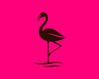
I worked on another old concept of mine and changed it up. This could be a financial institution logo or some such.
Status:
Client work
Viewed:
8811
Share:


Lets Discuss
Beautiful. The font and symbol work very well together.
Replyagree, really nice job. this is a small thing, but i think there needs to be some white space between the neck and head, because a horse's head doesn't press perfectly against it's neck when in that pose, right? i think the type may be a tad too heavy, but nice job nonetheless :)
ReplyThis could be a financial institution logo maybe but financial injection most likely!
Replyand by the way I like your colourful portfolio.
Reply@oski - Haha too true! Thanks for the kudos
Replygreat job! would you give me your email address?
Reply@ solid_snake - Sure, it should be in my profile. I think I want to avoid posting it all over because of spamity spam!
Replywhat a fantastic logo and type, the little touch of the hoof in the negative space of the s is brilliant.
ReplyPlease login/signup to make a comment, registration is easy