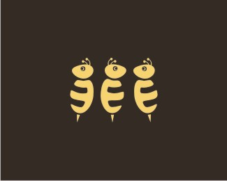
ya, i saw it too. . .(go figure) but the style is soo different i think you get away with it. **ps i copied your link to see if you were referring to my old logo, and if you leave off the three at the end. . . that logo looks absolutely nothing like this. Totally thought you were crazy at first. I have good news, you're not.


Lets Discuss
Holy cow, I was working on something just like this called Tweetness. Small world!
Replyme to :)
Reply:) Tweetness is a cool brand name
Replyhehehe...i was thinking of a similar brand called twoffee, but when i saw this i dropped that off my list :-)
ReplyOops no TWOFFEE in TWINGDOM :)
Replyya, i saw it too. . .(go figure) but the style is soo different i think you get away with it. **ps i copied your link to see if you were referring to my old logo, and if you leave off the three at the end. . . that logo looks absolutely nothing like this. Totally thought you were crazy at first. I have good news, you're not.
ReplyWOW my first gallery entry and I feel good I chose to do what am doin'
ReplyWell Trevor I didnt get what u meant by %22and if you leave off the three at the end%22 Thanks for givin me a clean chit anyways
ReplyI've always found to be an awesome design! Gratz on the showcase status, well done :)
ReplyHey thanks Nima and Jen!
ReplySir??? Its a female brain behind the logo :)
ReplySweet! :-)
ReplyI think the stroke in the icon could fatten up a little to match the stroke in the font. Outside of that fun logo.
ReplyHey Shaun, Its cool... and Thanks for appreciating
Reply@ big jerk: I believe fattening the stroke will make it look more bold and less SWEET..???
Replysweet! :) I like it.
ReplyThanks KonradK
Replyhttp://www.awwwards.com/gallery/39021/21
ReplyWow! How cute!
ReplyPlease login/signup to make a comment, registration is easy