High Point
by truenorthe • Uploaded: Apr. 10 '09
Description:
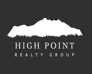
Concept for Realtor in Washington state, hence Olympic mountain mark.
Status:
Unused proposal
Viewed:
4609
Share:




Lets Discuss
I like the general concept, although I think the tracking is a bit too spaced out. That may be a reaction to the sanserif font in particular here. Also, I'm a bit concerned that the grass along the bottom would be hard to duplicate at very small sizes, or (for example) sewn onto a polo shirt. You may want to make those grass blades from broader, simpler strokes.
ReplyThanks jtroll!
ReplyPlease login/signup to make a comment, registration is easy