Personal logo
by logotomy • Uploaded: Apr. 08 '09 - Gallerized: May. '09

Float
(Floaters:
22 )
Description:
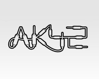
The "b" support the "i" to differentiate the name from Oliver.
Looking for your advices.thanks
updated.
Status:
Nothing set
Viewed:
5478
Share:


Lets Discuss
Why not connecting I and B then, and making it look like a tall B with the dot on it?
ReplyActually, It is exactly what I have just done.Gonna post it right away. I am just not sure of keeping this vertical composition for maybe a more linear one.
ReplyUpdated. I kept the foot of the %22i%22 since it was perturbing a bit the readability without.
ReplyAwesome! Don't wanna change a thing.
ReplyThanks mabu. Love your style.
Replylooks good, simple and good.*i'd suggest you keep it this way, i have tried in a few logos the tall b or d letter with an i on it but as you said it's getting a little confusing. *
ReplyThis has a respectable presence about it. Nice work. Even though it is a simple logotype, the ligatures and tight kerning makes it memorable.
Replythis is sweet.. is it for you?
ReplyThanks Yep it is for me, I am agreeably surprised to see it here.
ReplyI think the typography is just right,...classically simple nice job
ReplyWHOA! This is nice.
ReplyGreat typography - a very nicely done logo.
Replynice type composition, gj!
ReplyHey thin the logo works really well. Love the choice of typeface, what is it?
Replythanks, the typeface is a Glypha with some kernings tweaks.
ReplyStep back in time...
Replyreally nice, great typeface and letter spacing. love it
ReplyPlease login/signup to make a comment, registration is easy