SAS
by LogoBoom • Uploaded: Mar. 31 '09
Description:
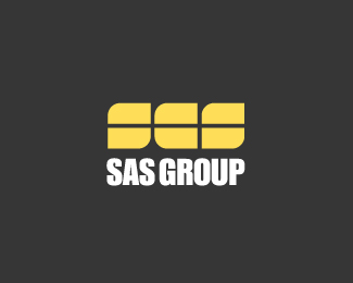
Proposed corporate monogram mark.
Status:
Nothing set
Viewed:
1876
Share:

Lets Discuss
It looks like SCS to me. If you were to curve both tops and leave the bottoms sharp (so that it looks like an uppercase A) or curve all but the bottom right corner (so that it looks like a lowercase a) it would look a lot better, in my opinion.
ReplyGood POINTS all around but since this client is MIA (deja vu with logoholik) I don't think I'll be addressing it just yet. Thanks for lookin!
ReplyYeah, exactly what Ryan said - rotate A 90 deg clockwise and it'll be perfect.
ReplyPlease login/signup to make a comment, registration is easy