Zeus
by grigoriou • Uploaded: Mar. 31 '09
Description:
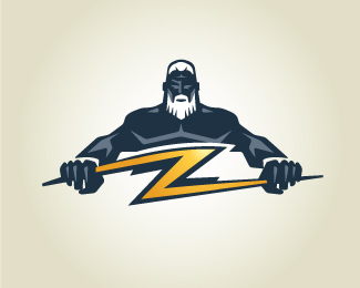
Logo for an electric company.
As seen on:
ZeusBolt.com
Status:
Client work
Viewed:
21279
Share:


Lets Discuss
I hope that he finds a home too. Great mark.
Replyawesome graphic!**
Replyvery nice illustration!
Replyzeus is awesome, the bolt needs some adjusting. the top of the bolt has a curve that i think needs to be a straight edge.
ReplyFantastic illustration.
ReplyGreat mark, harmonius colors!!! Probably Z letter nedds to be corrected as Gyui said (just my opinion%3D)
ReplyI love the illustration. You are great at integrating letters into the illustration as well.
Reply*i just a call for entries in the mail from logolounge and this mark was on the cover!
ReplyYe, this one%60s brilliant and really powerful mark. Have you added any type to it? Would be nice to see how%60s that incorporated..
Replyv.nice!
Replythis is great
ReplyPlease login/signup to make a comment, registration is easy