steez.
by Muamer • Uploaded: Mar. 24 '09 - Gallerized: Mar. '09

Float
(Floaters:
45 )
Description:
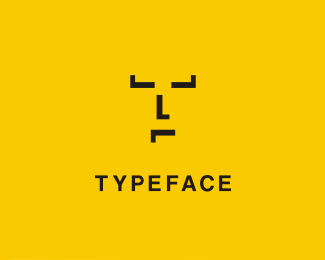
Super tees : steez // © Muamer ADILOVIC DESIGN // MA:DE
Status:
Nothing set
Viewed:
10559
Share:


Lets Discuss
This way works best.*The colors are fresh and lively along with the mark.*The z may need to be kerned in at a large size.
Replyi really like this mark, very unique
Replylove the mark and the type...great work :)
ReplyThanks YO! @Paul (:)
ReplyKind of familiar, I still like this%3C %3B) Is it a personal project? **%3EA double feature!!%3C
ReplyNice mark, agreed with PR on the kerning of the %22Z%22. *How come the same logo is featured 2 times in the gallery?
ReplyI guess it's just that good? %3B-)
ReplyThe design so nice they fav'd it twice.
ReplyOoh, a double featured logo. I think I like this better
Replyvery nice, I see a face.
ReplyI like it.
ReplyI agree with Paul, it looks 10 years younger than the other option...
ReplyThanks everybody!**@Alex: ohh, remember?lol! :Double feature: I am surprised too! :)*@Mr. J: You must ask David %3C?%3E Thanks!*
ReplyOLP ya know? I think this proofs the brand recognition %3B)
Replylol, you know my steez! :)
Replycool! :) nice work...
Replygreat
ReplyNikotin %26 Daniel %3E Thanks! %3B)
ReplyPlease login/signup to make a comment, registration is easy