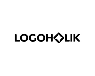
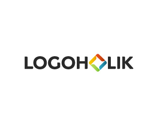
Logoholik (inverted colors)
by logoholik • Uploaded: Feb. 18 '09 - Gallerized: Mar. '10
")
Float
(Floaters:
91 )
Description:
Since Serbian economy is slowly getting back on track, logical decision was to revamp my old identity and make it work better in my secondary channel - offline world, ie old school print :) Attempt is to maintain playfulness and appearance of old one, keeping the same message and feel, while attaching a possibility for it to work in one color/bw environments.
As seen on:
Logoholik.com
Status:
Client work
Viewed:
19452
Share:

Lets Discuss
like it, got star into it ... positive facelift for sure
ReplyI really like the upgrade, thumbs up! :)
ReplyBojan... I wonder why have you not just switched to branding yourself by your name?
ReplyBart, i was thinking to do that two years ago. Meanwhile it grew by itself, rendering the solution you mentioned inappropriate at the moment. Now, from this perspective, logoholik brand is doing really good and i don't want to spoil momentum here. From it's beginning it had specific target group and reasons for being, looking and breathing like it is now. Serving it sole purpose to create an interest at my logo work and complementing services from clients worldwide.
ReplyWell thought out plan there Bojan. I like the new look. Reflects more of your new direction in style and ability!
ReplyNice update, Bojan!
ReplyThanks Sean. It was sitting in my drawer for a month, been thinking about it recently, hence decision is made :)
ReplyNice type bud!
ReplyMake me one!
Replyeh, Gareth, you don't need me at all :)
ReplyThis is it my man! Pokazi im svima... :)
Replylol Alen :)
Replythis new update is perfect. i love the subtle custom work done on rounding the edges and giving it a more soft feel - rather than the old sharp logo, this has a much more approachable feel, great job bojan, as usual %3B)
ReplyThanks Sean. That was one of the goals. Now i have to work on my site :), again :)
ReplyGreat fresh update Bojan!...really suits your style.
ReplyThanks Fabian!
ReplyThanks Raja! For what is worth i think your personal logo is certainly top notch, and among the best personal identities i've come across. Cheers!
ReplyI think both of your personal logos are among the best - Logoholik and Raja.
ReplyThanks a lot!
Replynow its my turn! :)*i can't understand this logo*explain pls:)
ReplyWell, it's... me... logoholik, you know? :) always on the move, playing with shapes and communicating my thoughts while having fun like wind does with kids toy-paper fan on stick :) Got it? I didn't :)
Replydman..thats complicated
Replynah, it's just a colorful icon replacing one letter in my logotype... better? :)
ReplyWicked updated, Bojan.
Reply-d :)
Replywicked? thanks! :)
ReplyGreat update!! Love it!!
Replyone of my favorite designers. Nice logo.
Replysolid update. Good to see things picking up in your economy. The irish one is still a basket case.
ReplyI've always loved this design's simplicity and impact. Inspiration indeed!
Replycool type! )
Replyg8 name..is it patent by u...:P
Replyrecognizable.
ReplyCool logo!
ReplyNice, Bojan. Cheers, buddy!
ReplyNice to see this logo on homepage.
ReplyNice logo! - I bet it look even better in print. ***on a side note, I will be speaking at Belgrade Design Week this year (if I don't chicken out) , will you be going?.. I have to remember if I ever said anything bad to you! LOL
ReplyNice animation on your avatar
Replylove the colors!
Replytoo much windows / google like application to me
ReplyThanks again folks!*@mcdseven that's old news my friend, it actually didn't end up like i forecasted at all :(*@raja it's too %22mainstream%22 for me :) but if you're comming, i'll see to welcome you there. Btw - that's nice opportunity to have European Logopond Summit in Belgrade, huh? %3B)
ReplyVery nice.
Replyvery nice identity logo..how you do that ? lol :)
ReplyAlways liked this one, Bojan. The spinning hurts my head sometimes though :P
ReplyI like the new look. Reflects more of your new direction in style and ability
ReplyAnyone heard from this guy in a while?
Replynope ... :/
ReplyNope...
ReplyBojan and Nav have more important things to worry about - like bringing up babies!
ReplyOK grandpa... %3B)
ReplyOH, that's a good thing. Explains a lot.
Reply:) indeed. Still working, nothing spectacular to show here recently. But yes, babies took my online time almost completely :) But since i was jumping from every rock back in a days :) it feels good to work like this for a change. If business goes downhill in some way, expect me again here tho :) Cheers for logoponders!
ReplyAight man, nice to thear that you're OK, good luck with everything!
Replyi really liked the typography... which font is it?
ReplyThanks^. Typography is handmade. Cheers!
ReplyPlease login/signup to make a comment, registration is easy