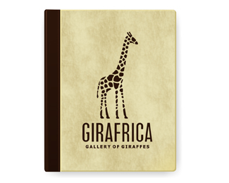
GIRAFRICA v3
by Logomotive • Uploaded: Jan. 04 '09 - Gallerized: Jan. '09

Float
(Floaters:
103 )
Description:
as per Toni's request. here is my third version. I think it looks best but is Africa Gone?
Status:
Unused proposal
Viewed:
32882
Tags:
Africa
•
Giraffe
•
Book
Share:


Lets Discuss
Still see Africa?......Toni.
ReplyI even got Madagascar in there :-)
ReplyMaybe a bit subtle now?
ReplyWell, thanks for your input Toni, being a %22Giraffe Guru%22 AND a logo designer you pull some weight into my decision, however..... I did like the solid aspect but we shall see if others feel subtleness in this design works? Visually it's the most appealing IMO.
ReplyI keep shuffling between the three and visually this one is the most appealing, yes, and I think if you're looking for Africa in the spots it is visible, but otherwise maybe a bit too subtle? It's hard for me to say because I already know its there. I think my vote would be for V2, though, because the size and location of Africa in that one really make it stand out and at the same time it maintains a good perspective of the giraffe.
Replysorry lundeja, updated this at the same time as your post. this might be a solution???
ReplyRAWR?? WIT?
ReplyI'll take bi-color for the win, please %3B)
Replyor tri, I guess depending on how you look at it.
ReplyMe tooooooo DONE!
Replyhows about a lion?...
Replyhow about some quote marks?
Reply%22Africlion%22 good idea nido.
Replylol!... hows about some quote marks?... nice...
ReplyHow about if the lighter brown was slightly warmer?
ReplyIf it aint broke, why fix it? The original one was much better.
ReplySean, apparently it was that's why I fixed it... Just ask Toni :-)*Visually I like this one.Roy, I reversed?*finding out why a green flag is not always the best, you get pulled in a few different directions.
ReplyI like em all. If I was selling it to a client I would probably differentiate the Africa map colour a bit so it stands out even more. Even though it's still real nice. Many opinions on this one though eh!!
ReplyJust showed my better half this one, she is very fussy and thought this was really awesome!
Replyi think this is really well done, great colors!
ReplyMike brought the sexy back a long time ago!!
ReplyHahaha. :-P
ReplyI love this logo. I completely agree with how Africa is subtle in the giraffe, I havn't been on to see the other versions so I didn't know it was there, but I did notice it. Nice touch!
Replylove it.
ReplyThanks guys, and thanks for all the help (Toni).*I'm too sexy for my car,to sexy for my car, too sexy by far :-)
Reply%5Ethanks God*
Replywhat is wrong with you guys.. :)
Replyah man...I wanna be sexy
ReplyGreat one! Reminded me of Yoga Australia :)
Replysimply love it.
Reply@logotivity, weird bunch huh?*@ Logoboom, you R*@ SANDHYA, yeah Roy rules.*Thanks Rambal :-)
Replywow this is greaaat!!
ReplyDamn that's one sexy beast!
Replyamazing logo! *i love the subtleties... just great
Replynice
Replytall work order but again, spot on!
Replyrock on, giraffes, rhinos, lions, gazelles... you've got a knack for animals that live in africa!
ReplyThanks guys, yeah tall order,is a sexy beast and yeah animals are fun subjects to work with. Appreciate the comments. I'm compiling my Logomozoo portfolio :-)
Replyi love the subtlety of the text. it took me a second but I saw 'africa' pretty quick. perfect for the second look :)
ReplyGranted i havent seen the other ones but i had no problem seeing the shape of africa as part of the Giraffe, I think its spot on, I even noticed it on the smaller preview first which is what brought me to look at the bigger version.*Subtle detailing, Good work!!
ReplyI like.
Replywithout words
Replysexy.
ReplyThanks guys, yeah giraffe's are kind of sexy animals huh? but us 5'8%22 guys can be too as pointed out by Toni. %3B-)
ReplyAfrica is hard to see , but not impossible*
ReplyYou would never know why I love this logo so much!! :-)
Reply%5EBecause it's sexy like me? *curiosity has got me now?
Replyi keep coming back to this Mike.*Dam you this is so freaking great... really one of my fave logos of all time!
ReplyThanks Rich, nice words my friend.
Replysimple. awesome.
ReplyThanks december.jy.
ReplyIt's so cool how the 'variations' change now on view. Nice Job David.
Please login/signup to make a comment, registration is easy