Roosevelt Institute
by liquisoft • Uploaded: Nov. 13 '06

Description:
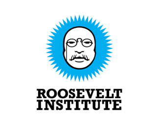
A proposed logo direction for Roosevelt Institute, a student-run political organization aimed at involving themselves in politics. They wanted to become more attractive to the 20-something young college crowd, so this solution accomplished that by playing on the familiar style of \"Obey.\"
That\'s a simplified illustration of Teddy Roosevelt in the center (he\'s their namesake).
Status:
Nothing set
Viewed:
4079
Share:


Lets Discuss
Really great, I don't think you should change anything. The blue burst adds a perfect burst of color to the logo. Don't take it away!
ReplyPlease login/signup to make a comment, registration is easy