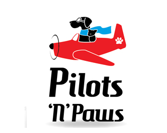
Pilots 'N' Paws
by grabbdesigns • Uploaded: Dec. 16 '08

Float
(Floaters:
5 )
Description:
Logo proposal for a fantastic organization I have been working with!
I would like lots of feed back b4 I go to them with this!
As seen on:
Status:
Nothing set
Viewed:
2050
Share:
Lets Discuss
Cute illustration!
ReplyI really would like lots of feedback on this one, it is really important! I added a tongue to the dog to make it a little more of a fun feel. What do you think?
ReplyHello Brianne! I think that you don't need that paw in word pilots... Mark is very cool, but also think that it needs a bit more friendly typography (not sure what this logo is for)... Maybe even to lose that back wheel on the plane... Just a bit more work here, but overall very nice concept...
Replythanks type08 - and congrats on the featured gallery! - this logo is for a non profit org. where pilots sign up to transport animals from over crowded shelters to less crowded ones cross country, thus saving them from being euthanized. they do it on their own time and money and is a great org. So thanks for the feedback, I will work on this!
ReplyThank you and good luck with this one, Project sounds very interesting, you're on the right way to really nail it!
Replythanks again type08 - i took your advice and switched it up a bit... what do you think?
ReplyHi! Mark is better now, but something about this typography bothers me... Just a little bit more work with it... I think that letters don't need that flying effect, to much going on now, let this interesting mark tell a story... IMO...
ReplyUpdated. Still would like lots of feedback/suggestions
Replythe only thing I would suggest is removing the gradient from the scarf and shortening it, so that it doesn't cover the tail of the plane, that way you're not trying to cram the little paw in there. Nice job in developing this:)
Replythanks gyui... so right on the scarf... it seemed to big and plain so i added the slight highlight, but definitely looks better shorter and solid! thanks!
ReplyThis is developing nicely. Just a couple of quick thoughts/suggestions. Some of the line weight in the mark concerns me. It gets lost at smaller sizes. Also, it might be better if the plane is facing the other direction. And have you tried a different layout of the elements? Perhaps stacking the mark on top of the logotype? Hope this helps.
Replythanks ocular, i have not tried the plane facing the other way, but that is a thought, and i originally had the layout stacked, maybe i should try it again then with the newer font.
Replythis is a great illustration and a fun mark! *this feedback may be way too late, but the face area might be a little too detailed (i think the tongue gets lost, esp because it's black)--have you tried making it red?
ReplyHey jsae, thanks for the feedback. I made another version of this logo (don't know if you saw it) - tongue kitty. Unfortunately the organization has decided not to change their logo, which is a total bummer!
ReplyAh, i understand--oh well, at least you have a great illustration that--you never know--may come in handy one day...
ReplyPlease login/signup to make a comment, registration is easy