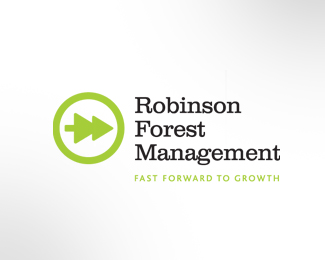
Robinson Forestry Management
by LloydCreative • Uploaded: Oct. 15 '08 - Gallerized: Feb. '11

Float
(Floaters:
20 )
Description:
Logo concept for company that specialises in the management of forestry.
Status:
Nothing set
Viewed:
7315
Share:

Lets Discuss
Not too sure what to think of this one. The concept of an implied 'R' within a tree form is an interesting idea, but for some reason it doesn't jive with me. Also the color scheme is a bit jarring, unless this is the color scheme provided by the client. Overall good idea.
ReplyI have to agree a bit with Jedah. I like the R/tree duality but the layout just isn't working for me. Great potential though.
ReplyI think its a great idea, but i also agree. The background color is kinda dirty, and doesnt deliver the %22forest%22 vibe to me and the piece at the bottom is really pointing out leaving the name kinda unreadable. But the basic concept is nice...
ReplyI enjoy the color scheme. It's almost like a hazard or caution sign but for forest management. Solid work.
ReplyI like the color scheme, myself.
ReplyStylish..
ReplyHey all - thanks for your comments and input.
ReplyPlease login/signup to make a comment, registration is easy