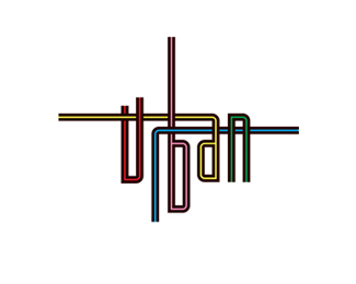
Love the design, but if the width of each letter was increased may be 10-15%25 I think the concept would hold while making it just a bit easier to read.
I like logos that make you look a little longer. Brand recognition happens in seconds. If you make them look a little longer they will retain it more. Nice work
Yep, BRAUN!*Switching colors between the %22U%22 and the %22B%22 may aid in seeing the U first and reading it as URBAN and not BRAUN. *Otherwise the thinness of the font and the lightness of the U combined with the similarity to the BRAUN mark makes the viewer see BRAUN first.


Lets Discuss
like the concept
ReplyI like. I don't even have a problem with the legibility issue. I think it works in this edgy genre.
Replylindissimo1
Replylove this design!
ReplyLove the design, but if the width of each letter was increased may be 10-15%25 I think the concept would hold while making it just a bit easier to read.
ReplyNice colors, too.
ReplyI like logos that make you look a little longer. Brand recognition happens in seconds. If you make them look a little longer they will retain it more. Nice work
ReplyI wouldn't change a thing- good job!
ReplyNice concept. It makes you take your time looking. I do have to say that I keep reading is as Braun though :P**http://www.freecorporatelogos.com/thumbs/BRAUN.jpg
Replyno shit, I read BRAUN too
ReplyYep, BRAUN!*Switching colors between the %22U%22 and the %22B%22 may aid in seeing the U first and reading it as URBAN and not BRAUN. *Otherwise the thinness of the font and the lightness of the U combined with the similarity to the BRAUN mark makes the viewer see BRAUN first.
ReplyYou all see BRAUN, because you're brainwashed by the popularity of BRAUN logo, that's all. Fantastic logo.
ReplyGreat design!!!
ReplyPlease login/signup to make a comment, registration is easy