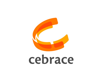
Biomax (2005)
by sebastiany • Uploaded: Sep. 17 '08 - Gallerized: Oct. '08
")
Float
(Floaters:
27 )
Description:
Biomax is a naming and logo design develop for a Bio-diesel brand. - Logo Featured in Logolounge book 4
As seen on:
www.biomax.com.br
Status:
Client work
Viewed:
12080
Share:

Lets Discuss
Very nice type treatment. The bottom stuff I assume is part of a brand development.
ReplyYes. This %22pattern%22 is present in all stationary, veicles, etc.... This brand was published in Logolonge book 4
ReplySebastiany,**Case dessa logo est%E1 publicado no Logo Lounge 4. H%E1 inclusive um pegueno erro: %22...Sebastiany Branding of S%E3o Paolo...%22 :/*Comprei o livro fora e gostei bastante.*Enfim, mais uma vez voc%EA e sua equipe fizeram um %F3timo trabalho. Parab%E9ns pela publica%E7%E3o do caso no livro, mostra que o Brasil tem for%E7a e principalmente, criatividade e compet%EAncia.**Show de Bola!
ReplyObrigado nymest!!!! Se n%E3o me engano tem uma parte do texto escrita %22guilherme sebastian%22 erradamente sem o Y no final do meu nome.
Replyjust to complet the information: the main caracteristic in Biomax visual identity is not the logotype, but the patern it self
ReplyFamous!
Replyhhahaha... not yet, but we are working on-it
ReplyI don't like this at all
ReplyYurko read Logolounge 4 and you will appreciate it more. There is an article explaining exactly why the swooshes are part of the brand alongside colour choices. Great work sebastiany!
ReplyThank you Itsgareth for good advice. I know about Logolounge but in the same time I have my own opinion. Of course I can find some useful information in Logolounge. But I don't like this work and I don't think this is cool. And such kind of swooshes I've seen millions times. This is bull sheet.
ReplyNo yurko your comments are often %22bull sheet%22 and never offer any kind of constructive criticism. %22I dont like this%22 should be your catchphrase.
Replythe swooshes ruin it
Reply1. there are no idea in logo*2. type is ok but not something special*3. idea of swooshes like a part of brand is very old and very common. i would like to see something new*4. the only way to show %22bio%22 is green colors?
ReplyDudes... no need to fight about it. %0D*%0D*Yurko is right wen he says that there's nothing special in the logo, but Gareth is also right when he says that you can' t comment a logo aggressively like: %22I don't like this%22 period.%0D*%0D*Let me just say something... Along the next days we will slowly post about 240 logos... all in use. But many of those logos are note really impressive or creative. This is not how we work here.%0D*%0D*We do not focus our work in creativity, or creating something new every time. What we do believe, is that a logo should work to communicate a message about the company. Not ways, this message is what the company do, but how it does it, and that values that it stands for. %0D*%0D*Most of our work probably will not feature a book for publication, or win a prize or something else. But they do work forward the company they stand for. We have many cases of uncreative logos that increase the selings of products and stores in more than 20%25 in one month. %0D*%0D*To do that we spend many hour in research (most than we do spend in designing it self).%0D*%0D*In BIOMAX project, if the logo were too creative, it wold probably not work to increase the trust in the project. The distinguish part is the waves texture that brings the (obvious) idea of a green friendly fuel... just that. %0D*%0D*Nothing extraordinary, I agree... but totally appropriated... and with many substantial results on both image, media and selling.%0D*%0D*Ok Dudes.
Reply%5E Well stated. Branding is not as easy as just designing a logo. I think this is very nice and has great flow to it.I actually like the fact that you showed more of the branding side here.No need to defend your work it speaks for itself but understand your points.
ReplyTrue the swooshes are common (at least now anyway), but what I like about the usage here is that the swooshes aren't just randomly placed, they have a function, like the way they wrap around the cooling towers, the trucks, everything. As sebastiany says, a lot of thought went into that, so I appreciate it. Also I think it says in the article that the colour green was chosen to differentiate from competitors as red and blue are commonplace, so again, I appreciate that.%0D*%0D*Not every logo has a hidden arrow, some logo's , just make you think %22yeah, that's good work%22, and this is one of them.
ReplyWell said Sebastiany.**People have to realise that there is a huge different between logo design and branding and judge each logo accordingly.**Clearly this logo is part of a branding exercise for Biomax, which would include all supporting elements (swooshes, colours etc.) with typography (key messages) and also photography. All these element form the visual identity.**This kind of exercise is at the opposite end to doing a logo for a local plumber, which would just require a logo and a business card (usually).**Unfortunately it is harder for branding to be displayed on LogoPond and be appreciated without showing the logo in it's environment (glory) without cluttering up LogoPond.**Keep up the good work Seb.
ReplyWhich is why this isn't BrandingPond.com. But regardless, the choice here to include some of the brand elements just adds to the presentation. It's no different than a colored or textured background that others of us may choose.
ReplyI think this is refreshing. I like the type treatment and think that this logo is very suited for the petroleum industry and is evidence of a well researched market. Well done.
Replythank you sebastiany. it was nice speech. i agree with you for 100%25. i can be wrong but the main reason i visit logopond is logo design. it means i'm interested in design and try to find something new. but if we start to discuss branding i think we need to create separate topic and to show more information in our showcase, not only logo and decorative element but also describe brand strategy and so on.
ReplyI like this. Sure, maybe it is'nt does'nt have any clever graphic tricks to it, but it shows good craftsmanship. A lot of times there is hard work behind selecting and applying good typography. **I myself have made some %22traditional%22 looking logos. Once, for instance, I selected the type based on the type designers age being the exact same as the company's and both originating from Sweden. These types of underlying values were not apparent for the casual viewer.
ReplyI absolutely agree gthobbs.
ReplyWell said sebastiany. A lot of designers design for designers more so that for their client.
ReplyIn fact.... this is not %22branding_pond%22... should we create one? %3B-)%0D*%0D*Thanks all for the coments!!!!!
Replylove it!
ReplyWe have many cases of uncreative logos that increase the selings of products and stores in more than 20%25 in one month. **SAY WHAT?**I'm sorry but this sounds like you are trying to pull the wool over our eyes. Trying to corrolate business results with an identity program, put's you on the lunatic fringe - especially after 1 month.* *Brand building is a discipline capable of affecting sales results - but only over the long term. Please note that I said brand building - indicating something more holistic than just the graphic identity - integrated marketing, organisation design, the organisation's competence and strategy etc.**I agree with you that message (not style) should be the core of good communication but you seem to be equating being creative with being inappropriate.**Let me tell you creating effective work requires an element of bravery on both the agency and client sides. Cowardly work excites no one. Least of all consumers. **But consistently producing effective creative work is hard and while it is true that all human beings are creative up to a point, it is also true that anyone can hit a ball over a net, up to a point. That said, very few of us are going to win Wimbledon.**Sorry this is long - but it rubbed me up the wrong way. **:)*************
ReplyActually, renalicious, you are way wrong. Creative does not always mean bravery. And what you consider cowardly is not always unexciting. Especially when you consider consumers. Logopond has proved to me that what most designers consider a %22nothing but net%22 kind of logo, your average consumer won't mark as anything special%3B or more likely %22not get%22. There is very, very little subjective about winning Wimbledon, but design is mostly subjective. Your analogy doesn't work in this case. As for a brand spiking sales in the first month, that is easily explainable when you talk about product launching. Not all clients can afford branding upfront, so they launch a product without it until the revenue comes in. Then they pay for the brand, launch it, and up spikes the sales. Certainly that is not true in established products so much, but more often than not new logo/brand design is about new, or fairly new, products and services.
ReplyThe definition of creative according to the Oxford dictionary: *%22Creativity is a mental and social process involving the generation of NEW ideas or concepts%22. **As I already explained, doing something new requires an element of bravery. **I don't care whether the average consumer %22marks any piece of communication out as anything special%22. We are not selling art. What I care about is that he understands the message of that communication. That might need to be done by being ugly, scary, cool etc. One thing is for sure, given today's media saturation and diminishing attention spans, getting that message across intact requires massive doses of creativity.**As for brand spiking - you have misunderstood the point and moved the goalposts. I suggest you re read what I wrote.**You switched from talking about brand building to launching a product. That was my point - branding involves elements that have nothing to do with graphic design and also, it is impossible to prove that a spike in sales was caused by your graphic identity (unless you are lucky enough to count telepathy amongst your skills).
Replythere is a difference between %22being creative%22 and creativity. as a designer you are creative with what is given to you. if your client wants safe, if their demographic demands it, then you are creating responsibly. and probably getting paid.**and to quote a new hero of mine, Mark Simonson, %22The idea of creating only things that look new and different seems limiting. Anything totally new ends up looking hopelessly dated sooner or later anyway. Very few designs are truly timeless and I don’t know if it’s possible to design something like that intentionally.%22
Replythere is a difference between %22being creative%22 and creativity. as a designer you are creative with what is given to you. if your client wants safe, if their demographic demands it, then you are creating responsibly. and probably getting paid.**and to quote a new hero of mine, Mark Simonson, %22The idea of creating only things that look new and different seems limiting. Anything totally new ends up looking hopelessly dated sooner or later anyway. Very few designs are truly timeless and I don't know if it's possible to design something like that intentionally.%22
Replyerm... now you are agreeing with me?**I'm sorry but we shall just have to agree to differ (or ahem... agree). Innovation is probably the most important part of any business which is why companies spend so much on R%26D. But hey, you are entitled to your opinion as I am mine.**As for your quote: take a look at the work of Herb Lubalin as proof of how silly that is.
ReplyWhat I am trying to get across is that what Sabastiany wrote is not wrong. What you wrote is also not wrong. But something in what Sabastiany wrote rubbed you the wrong way. What rubbed me the wrong way in your rebuttal, which was a bit over the top, is your statement that consumers require effective work, which is true, but you stated it also has to be creative and brave, which it does not have be. Not by a consumer standpoint which is what drives design. **You are taking the quote too etched in stone. Mark says FEW designs (therefore designers) are truly timeless. Didn't say there were none. How many %22Herb Lubalin%22s are there compared to, well, every other graphic designer? Not saying we should not strive for it, just saying it is rare, often unintentional and most of us won't make it. Your statements seem to say we are all lazy, ineffective designers because we aren't like, or haven't reached, %22Herb%22 status every time we design something.
ReplyI very much like the type only solution of this logo. Job well done.
ReplyYou are failing to factor in that our job does not take place in a vacuum. The market is saturated with people pushing the same message, the same product, the same concept etc. In order to break through, you need to be creative (different).**The quote is silly - everything is affected by time eventually, but many things last a long time by design. The houses we live in last longer then most people live because they are built to last - even if they are not designed by I.M. Pei.**I have not called anyone lazy - please don't put words into my mouth.
ReplyGreat logotype, Sebastiany. However, I do think the tagline is a tad bit too small in this application. But what can I say, I love your work!
ReplyI said it was an implication, not a quote. But I see design, any creative design, as akin to evolution. It is a slow, advancing process with some brilliant (and not so brilliant) mutations along the way. I always strive to be creative, but the odds of being truly different, in a good brilliant way, are extreme. And with the subjectivity of our industry and work, a lot of good brilliance goes unnoticed and a lot of the opposite does.
ReplyWoohoo raise the flags, we're sort of getting around to some middle ground now where we agree on something.**When you say subjectivity of our industry, I take it you mean design contests. If you meant consumers, it's only brilliant if it helped the client achieve what he needed - no matter how many contests it wins.**It would be nice to think that those two areas overlap but like you, I doubt that is the case. I've always suspected that design contests lead to 'the tail wagging the dog' - that is you design the work to win the contest rather than solving your client's problem. **Anyway, we're hogging this thread so maybe we should wind it down. **Shorthand of my original point: *Attributing sales spikes to graphical elements in your identity is very difficult to prove - given all the elements you would need to consider. Claiming to be able to do just that after a month is naive.**Right, time to go to work. Have a nice day.****
ReplyI like to make things pretty.
ReplyMe thinks you should both take this to the forums. renalicious try keeping it a little open minded here.I'm getting the feeling you think your above the rest and your not.
ReplyLogomotive, I may have a different point of view to some of the people on this site but what does that have to do with being open minded? I never suggested I'm better than anyone else but if you feel the cheesy tiara fits you - that's not my fault. **Find someone else's leg to hump!
Replyconfused. the tiara fits me. and I think looks better on me as well. %3B) however, the king of design crown is not looking good on you. Logomotive's feelings are part of what I was saying, in a more wordy way. and he is right. your response to his post, like the original one, is overly harsh. passion is great, but you don't have to be unkind.
ReplyDudes... Lets not pick a ideological or personal fight here. This is not the place for that. **I have many friend that have different ideas about how and what logo design should be done, and yet, we cam be friend and respect our different point of views. **Renalicious, you have many great works, some of then I floated and Favorit. But some of then are neither creative or brave... and that do not make then worst.
ReplyMan i still think this is a wonderful logo. Soooooo clean and neat.
Replywhy all this fighting, the logo works. no matter if special or not, it is not ugly or badly executed, it catch the attention and it is dynamic. There is so many beautiful, artistic and really creativ logos on this website that would never work in the %22real world%22%0D*%0D*I personaly like this.
ReplyPlease login/signup to make a comment, registration is easy