novoda(TM)
by firebrand • Uploaded: Aug. 26 '08 - Gallerized: Nov. '08
")
Float
(Floaters:
25 )
Description:
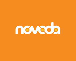
A company that develops lifestyle applications that use GPS data from mobile phones. The client wanted a brand that would communicate mobility, connectivity and satellite tracking.
As seen on:
Status:
Client work
Viewed:
11854
Share:


Lets Discuss
Very nice, Roy. I love how the line travels from the first 'o' to the 'a'. Great way to manipulate the negative space. One minor nit-picky thing...the base of the 'v' and 'n' doesn't have the same edge as the 'd' and 'a' and the top of the 'v'. Those appear more rounded/smooth. But very minor. :-)
ReplyVERY nice. Unique. Trademarkable. Cool. Nice one.
ReplyThanks guys. *I hear what you're saying Kev. I did try that but it was a bit curve heavy. Here's the font I used:**http://www.daltonmaag.com/browse/fonts/dama/co
ReplyI see what you're saying. Great design regardless!!
ReplyYou're just showing off now..good job again
ReplyVery nice.. I like it..
ReplyThis is super well done Roy. Really appropriate design.
ReplyThanks all. It was an arduous journey but the client is thrilled with the end result.
ReplyLos Logos inspired? Great work.
ReplyThanks. Guess it does bear a passing resemblance.
ReplyPlease login/signup to make a comment, registration is easy