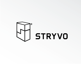
E.C. Engineering
by actiondesigner • Uploaded: Aug. 11 '08 - Gallerized: Aug. '08
Description:
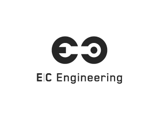
E.C. are the initials of the entrepreneur
Status:
Client work
Viewed:
25549
Share:

Lets Discuss
very clever dude!.. think you should go with a thicker type that matches the mark.. %26 maybe (slightly) rounded too?.. great nonetheless!
Replythanks ...and right on. I really wanted just the mark without the type. Then the type was added but chose a thinner type just to keep it more in the background. Posted without changing just to maybe get som feedback on the matter. Slightly rounded I dont know, but somewhat geometric (futura, Nobel, Avant Garde) was my main objective
ReplyThanks smartinup.
Replyvery well done!
ReplyAmazing! well done
ReplyVery cool mark! I agree with nido about the type, feels a bit unbalanced.
ReplyThanks all ...did and an update with a thicker type. More balanced
ReplyGreat job. I enjoy clever monograms.
ReplyIm humbled. Thanks guys.
Replybeutiful... great work !
Replythanks puzyo:)
Replygreat job, I like very much
ReplyMuch appreciated Studio Karma:)
Replyxlnt.... E.C is must be one happy camper
ReplyE.C. is a very satisfied:) **Thanks for your comment:)
Replynice concept...great
Replythis is premium.
ReplyPlease login/signup to make a comment, registration is easy