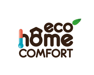
Eco Home Comfort
by c-ko • Uploaded: Aug. 07 '08

Float
(Floaters:
0 )
Description:
This was chosen by the client.
The client wanted to portray that they did home A/C and heating and that they were eco friendly. They also specified that they wanted a house in their logo.
Status:
Nothing set
Viewed:
6316
Share:
Lets Discuss
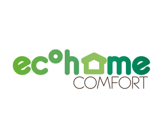
All the elements in this one are integrated together a lot better, well done! Did you try the 'E' and 'O' without the gradient? Might help emphasize the 'C' being hot/cold.
ReplyPlease login/signup to make a comment, registration is easy