Royal Crown Sponsorship
by creativeheart • Uploaded: Jul. 07 '08

Description:
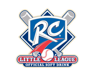
I am interviewing for several positions from SR AD to CD and I need some input, would you include this in your book? This logo was a sponsor logo developed for RC. I was charged with taking the existing logo and modifying it for a little league sponsorship. Would you show it and why? or why not?
Status:
Nothing set
Viewed:
1740
Share:


Lets Discuss
I think this is strong. I would suggest making the outer blue and cream strokes thicker...%22when it comes to sports branding, less is more defined by bold accent areas of color or shape%22 - bartodell %3B)**I think there are stronger logos within your logopond portfolio, but it might be nice to demonstrate your strengths in this style of logo design.
Replythanks
ReplyI think it's a real strong logo (probably one of the overall strongest you have on here) but you have to consider both the type of work you'd expect to do while working with them, and also the strength of the other logos you are considering... without that, it's hard to give a clear answer. I think it's nice for showing diversity, though.
ReplyPlease login/signup to make a comment, registration is easy