Australia Telescope Outreach and Education
by HelloUriah • Uploaded: Jul. 06 '08 - Gallerized: Jul. '08
Description:
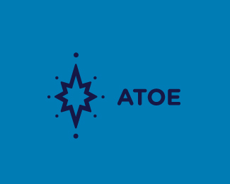
An outreach program in association with The Australia Telescope National Facility (ATNF)
Status:
Nothing set
Viewed:
3661
Share:



Lets Discuss
Not a big fan of your type solution (perhaps a bit bland? and too much towards the right) but really like the symbol. Nice
ReplyThanks david and dache, ill knock out the white and try a view typefaces. Maybe Gotham Rounded, being a education program targeted towards school students, might match the symbol better as well.
ReplyThe mark in relation to the text does not seem to have a visual lock-up. Maybe if you balanced the two by reducing the mark's thickest stroke to the same weight as the text it would work better in my opinion. Doing this by just scaling the mark would provide the balance it seems to lack.
ReplyThanks Bart for the critique. I scaled up the type a touch, and the line thickness matches better. The mark relates to a star within a compass on an old map my grandfather has, which references to sailors uses stars to navigate the seas. The different points are the views of the sky to view space activity at different times of the year.
ReplyI understood the concept of the mark perfectly. I was just concerned that when presented together the mark and the text had no visual balance. Now they are perfect in my opinion. Nice work Uriah.
ReplyThanks again Bart, and Clash. Client doesn't want it though.
ReplyPlease login/signup to make a comment, registration is easy